Visualizing Tabular Data
Handouts for this lesson need to be saved on your computer. Download and unzip this material into the directory (a.k.a. folder) where you plan to work.
Lesson Objectives
Specific Achievements
- Create “aesthetic mappings” from variables to scales & geometries
- Build boxplots, scatterplots, smoothed lines and histograms
- Style plots with colors & annotate them with labels
- Repeat plots for different subsets of data
“A Layered Grammar of Graphics” is the title of an article by the author of ggplot2, Hadley Wickham. The package codifies the ideas presented in the article, especially the main idea that scientific visualization is all about assigning different variables to distinct visual elements. A plot is made up of several of these “aesthetic mappings”: for example, equating income to a linear scale on the y-axis, education to a ordinal scale on the x-axis, and displaying records about each person in a box-plot geometry.
Getting Started
In this lesson, we’ll explore the wage gap between men and women.
The file to be loaded contains individuals’ anonymized responses to the 5 Year American Community Survey (ACS) completed in 2017. There are over a hundred variables giving individual level data on household members income, education, employment, ethnicity, and much more.
The dataset is an example of Public Use Microdata Sample (PUMS) produced by the US Census Bureau. The technical documentation for the PUMS data includes a data dictionary, explaining the codes used for the variable, such as education attainment, and everything else you’ld like to know about the dataset.
The data columns we will use in this lesson are age (AGEP), wages over the past 12 months (WAGP), educational attainment (SCHL), sex (SEX), and travel time to work (JWMNP)
library(readr)
pums <- read_csv(
  file = 'data/census_pums/sample.csv',
  col_types = cols_only(
    AGEP = 'i',
    WAGP = 'd',
    SCHL = 'c',
    SEX = 'c',
    SCIENGP = 'c'))
The readr package gives additional flexibility and speed over the
base R read.csv function. The CSV contains 4 million rows, equating to several
gigabytes, so a sample suffices while developing ideas for visualiztion.
Layered Grammar
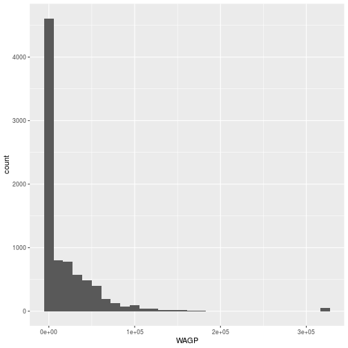
First, we will explore the data by plotting a histogram of the wages (WAGP) of all the individuals in the data set. The code to plot the histogram calls three functions: ggplot, aes, and geom_histogram from the ggplot2 package.
ggplotcreates the foundationaesspecifies an aesthetic mappinggeom_histogramadds a layer of visual elements
library(ggplot2)
ggplot(data = pums, aes(x = WAGP)) +
  geom_histogram()
`stat_bin()` using `bins = 30`. Pick better value with `binwidth`.
Warning: Removed 1681 rows containing non-finite values (stat_bin).
The ggplot command expects a data frame and an aesthetic mapping.
- The data is specified (
data = pums). - The
aesfunction creates the aesthetic, a mapping between variables in the data frame and visual elements in the plot. Here, the aesthetic mapsWAGPto the x-axis; a histogram only needs one variable mapped.
The ggplot function by itself only creates the axes, because only the
aesthetic map has been defined. No data are plotted until the addition of a
geom_* layer, in this example a geom_histogram. Layers are literally added,
with +, to the object created by the ggplot function.
Plotting histograms is always a good idea when exploring data. The zeros and the “top coded” value used for high wage-earners in PUMS are outliers.
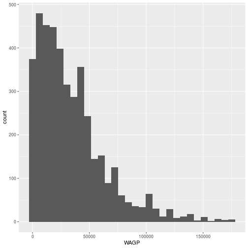
We can “filter” the data to remove individuals with a wage of 0 and the “top-coded” high earners)
library(dplyr)
pums <- filter(
  pums,
  WAGP > 0,
  WAGP < max(WAGP, na.rm = TRUE))
The dplyr package provides tools for manipulating tabular data. It is an essential accompaniment to ggplot2.
Now, we can remake the histogram with the filtered data set in the same way.
ggplot(data = pums, aes(x = WAGP)) +
  geom_histogram()
`stat_bin()` using `bins = 30`. Pick better value with `binwidth`.
The geom_histogram aesthetic only involves one variable. A scatterplot
requires two, both an x and a y.
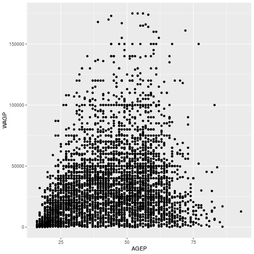
We can use a scatterplot to look at the relationship between age and wage.
ggplot(pums,
  aes(x = AGEP, y = WAGP)) +
  geom_point()

The aes function can map variable to more than just the x and y axes in a
plot. There are several other “scales” that exist, although whether and how they
show up depends on the geom_* layer. Commonly used arguments are color for
line or edge color and fill for interior colors, but many more are
available.
The aesthetic and the geometry are entirely independent, making it easy to
experiment with very different kinds of visual representations. The only change
needed is in the geom_* layer.
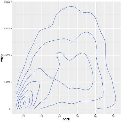
For example, we can plot the same data, age and wage, using a 2D density plot by switching out geom_histogram with geom_density_2d
ggplot(pums,
  aes(x = AGEP, y = WAGP)) +
  geom_density_2d()
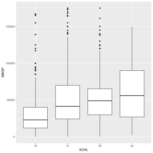
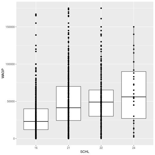
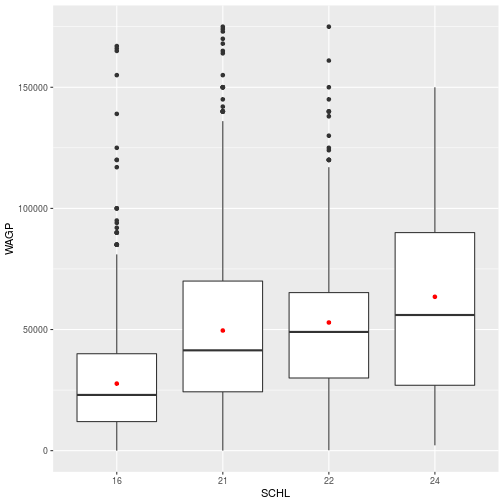
For a discrete x-axis, a boxplot is often beter than a scatterplot.
First, we can simplify the level of educational attainment SCHL variable’ by only including some of the factor levels and saving in a new data frame filter_SCHL.
Here, we include only individuals where the highest level of educational attainment is high school (16), bachelor’s degree (21), a masters degree (22), or a doctorate (24).
filter_SCHL <- pums[pums$SCHL %in% c(16, 21, 22, 24),]
Here, we plot wage by the level of education (SCHL)
ggplot(filter_SCHL,
  aes(x = SCHL, y = WAGP)) +
  geom_boxplot()
To create a scatterplot, a boxplot, and even a 2d kernel density estimate, the
geom_* function takes no arguments. Every layer added on top of the foundation
generated by the call to ggplot inherits the dataset and aesthetics of the
foundation.
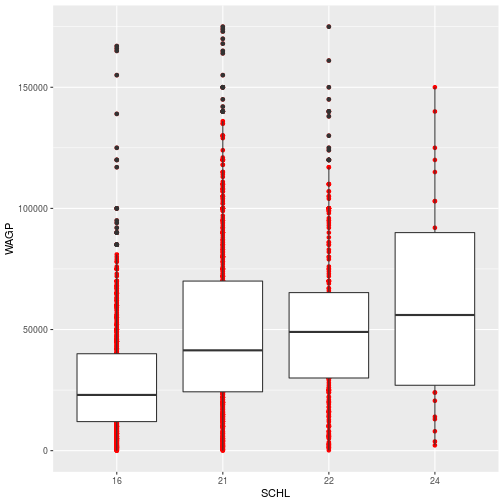
Multiple geom_* layers create a plot with multiple visual elements. For example, the data points can be added on top of the boxplots.
ggplot(filter_SCHL,
  aes(x = SCHL, y = WAGP)) +
  geom_boxplot() +
  geom_point()
- Question
- What happens if you supply
x = AGEPto the aesthetic map in the boxplot? - Answer
- Boxplots aren’t designed for continuous x-axis variables, so the result is not useful. Fortunately, there’s a warning.
Layer Customization
Each geom_* object accepts arguments to customize that layer. Many arguments
are common to multiple geom_* functions, such as changing the layer’s color or size. To make the points only from the scatterplot red, we add an aesthetic for color to the geom_point layer.
ggplot(filter_SCHL,
  aes(x = SCHL, y = WAGP)) +
  geom_point(color = 'red') +
  geom_boxplot()
The color specification was not part of aesthetic mapping between data and visual elements. In other words, it was not used to specify how the data are mapped visually. Therefore, 1) it applies to every record (or person) and 2) only the elements in the scatterplot layer are affected.
The stat parameter, in conjunction with fun, provides the ability to
perform quick data transformations while plotting.
Instead of using geom_point to display all the data points, we can add points for the mean at each educational level.
ggplot(filter_SCHL,
  aes(x = SCHL, y = WAGP)) +
  geom_point(
    color = 'red',
    stat = 'summary',
    fun = mean)
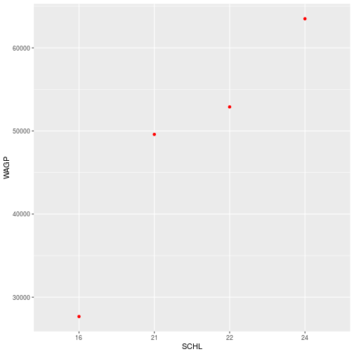
With stat = 'summary', the plot replaces the raw data with the result of a
summary function applied to a “grouping” that is defined in the aesthetic. In
this case, it’s the ordinal x-axis that defines education attainment groups. The
fun argument determines what function, here the function mean, you want to summarize each group.
Additional Aesthetics
The true power of ggplot2 is the natural connection it provides between variables and visuals.
Associating color (or any attribute, like the shape of points) to a variable is
another kind of aesthetic mapping. Passing the color argument to the aes
function works quite differently than assiging color to a geom_*.
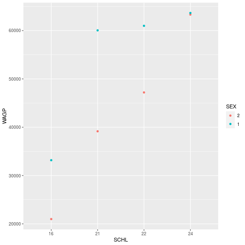
To show the difference in wages based on sex, we can color the points based on the SEX data column.
This time, color is specificied in the aes function because we are aesthetically mapping the data to an visual element in the plot.
ggplot(filter_SCHL,
  aes(x = SCHL, y = WAGP, color=SEX)) +
  geom_point(
    stat = 'summary',
    fun = mean)
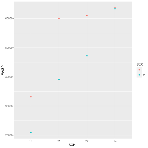
- Question
- What sex do you think is coded as “1”?
- Answer
- … Megan is skeptical about the answer!

Properties of the data itself are similarly independent of the aesthetic mapping and the visual elements, but they can still affect the output.
For example, see what happens when we switching the order of the levels of SEX in the data and then replot.
filter_SCHL$SEX <- factor(filter_SCHL$SEX, levels = c("2", "1"))

ggplot(filter_SCHL,
  aes(x = SCHL, y = WAGP, color=SEX)) +
  geom_point(
    stat = 'summary',
    fun = mean)
There can be cases where you don’t want to or can’t modify the dataframe. Then, it is still possible to change properties of the data to get the plot you’d like within the ggplot, aes, and scale_* functions. More on modifying plots with scale_* later in the lesson.
Storing and Re-plotting
The output of ggplot can be assigned to a variable, which works with + to
add layers.
Here, we will recreate the plot for the wage and level of schooling we made before.
First, we will store the plot, mapping only the boxplots for each education level.
schl_wagp <- ggplot(filter_SCHL,
       aes(x = SCHL, y = WAGP)) +
  geom_boxplot()
The plot information stored in schl_wagp can be used on its own, or with
additional layers.
You may notice that the plot is not displayed in Rstudio when it is stored. To plot the data, simply run the name of the stored object.
> schl_wagp

To add the points for the mean of each education level, simply add the geom_point layer to the stored schl_wagp object.
schl_wagp +
  geom_point(
    color = 'red',
    stat = 'summary',
    fun = mean)
When adding layers, you can save as a new variable or overwrite the existing variable.
schl_wagp <- schl_wagp +
  geom_point(
    color = 'red',
    stat = 'summary',
    fun = mean)
> schl_wagp

Figures are constructed in ggplot2 as layers of shapes, from the
axes on up through the geom_* elements. The natural file type for storing such
figures at “infinite” resolution are PDF (for print) or SVG (for online).
Use the function ggsave to save as an image.
ggsave(filename = 'schl_wagp.pdf',
  plot = schl_wagp,
  width = 4, height = 3)
The plot argument is unnecessary if the target is the most recently displayed
plot, but adding plot will ensure that the correct plot is saved. When a raster file type
is necessary (e.g. a PNG, JPG, or TIFF) use the dpi argument to specify an
image resolution. To save as a different file type, simply change the extension of the plot name (for example filename = 'sch_wagp.png').
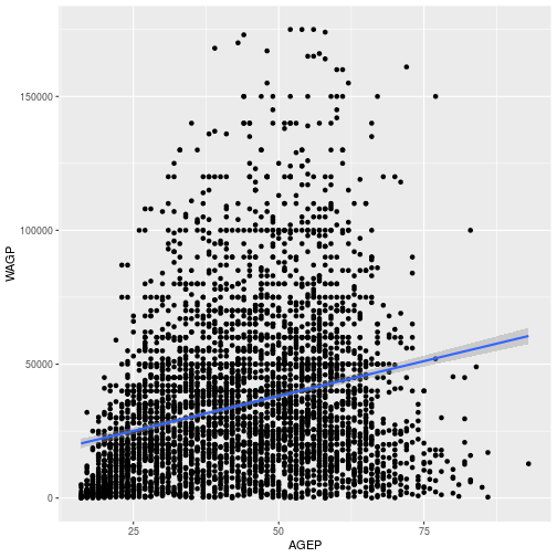
Smooth Lines
The geom_smooth layer can add various kinds of regression lines and
confidence intervals. The argument method defines the type of regression; method = 'lm' specifies a linear model.
Here, we will observe the relationship between age (AGEP) and wages (WAGP).
First, the scatterplot is stored as Age_Wage
 Age_Wage <- ggplot(pums,
       aes(x=AGEP, y=WAGP)) +
  geom_point()
> Age_Wage
Next, the regression line is added using geom_smooth using a linear model.
Age_Wage + geom_smooth(method = 'lm')
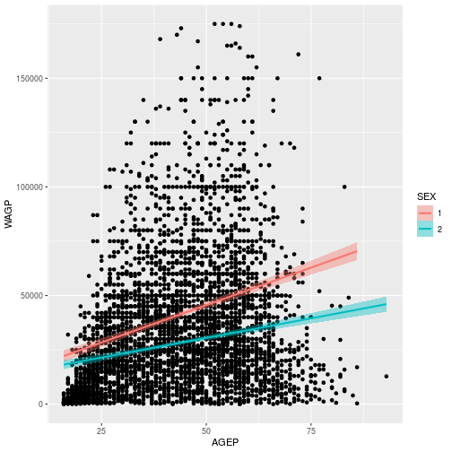
We can also use the aesthetic mapping to explore how wages differ by sex. To do this, map the color and fill to SEX, using aes inside the geom_smooth layer. In ggplot2, color refers to the outline and fill the interior coloring.
wage_gap <- Age_Wage +
  geom_smooth(method='lm', aes(color=SEX, fill=SEX))
> wage_gap
To learn more about adding regression lines, such as how to change the confidence interval, see the geom_smooth help page
Axes, Labels and Themes
The aes and the geom_* functions do their best with annotations and styling,
but precise control comes from other functions.
Functions include:
labs: labelsscale_*: scales such as color, size, and positional scalestheme_*: the stylistic theme unrelated to the data
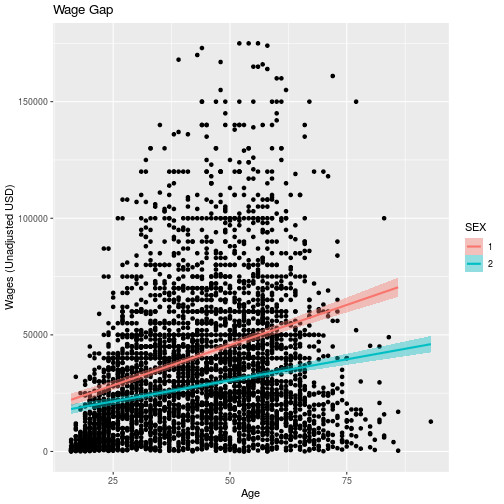
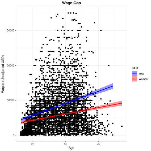
To demonstrate these functions, we can edit the plot showing relationship of age and wages based on sex, saved as wage_gap.
Setting the title and axis labels is done by the labs function, which accepts names for
labeled elements in your plot (e.g. x, y, title) as arguments.
wage_gap + labs(
  title = 'Wage Gap',
  x = 'Age',
  y = 'Wages (Unadjusted USD)')
For information on how to add special symbols and formatting to plot labels, see
?plotmath.
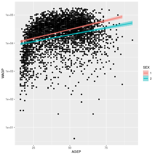
Scales in ggplot control how the data is mapped to aesthetics.
Functions related to the axes, i.e. limits, breaks, and transformations,
are all scale_* functions. To modify any property of a continuous y-axis, add
a call to scale_y_continuous. For example, we can transform the y axis to a log scale.
wage_gap + scale_y_continuous(
  trans = 'log10')
`geom_smooth()` using formula 'y ~ x'
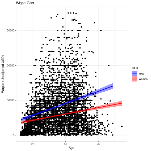
Scales are also used to control color and fill schemes. scale_color_* functions, for example, control the colors, labels, and breaks mapping.
We can use scale_color_manual and scale_fill_manual to manually specify the colors we want to use for men and women in the plot and relabel the factors from 1 and 2 to “Men” and “Women.”
wage_gap <- wage_gap + labs(
  title = 'Wage Gap',
  x = 'Age',
  y = 'Wages (Unadjusted USD)') +
  scale_color_manual(values = c('blue', 'red'),
                     labels = c('Men', 'Women')) +
  scale_fill_manual(values = c('blue', 'red'),
                     labels = c('Men', 'Women'))
wage_gap
“Look and feel” options in ggplot2, from background color to font
sizes, can be set with theme_* functions. There are also 8 preset themes in ggplot
wage_gap + theme_bw()
`geom_smooth()` using formula 'y ~ x'
Start typing theme_ on the console to see what themes are available in the
pop-up menu. The default theme is theme_grey. A popular “minimal” theme is
theme_bw. Any option set by a theme_* function can also be set by calling
theme itself with the option and value as an argument.
The options available directly through theme offer limitless possibilities
for customization.
Do be aware that if theme comes after other custom specifications, it will overwrite
those customizations. Check the order if your plot isn’t looking how you’d like it to look.
For example, we can center align and bold face the title using the following theme specifications.
wage_gap + theme_bw() +
  labs(title = 'Wage Gap') +
  theme(
    plot.title = element_text(
      face = 'bold',
      hjust = 0.5))
`geom_smooth()` using formula 'y ~ x'
Use ?theme for a list of available theme options. Note that position (both
legend.position and hjust for horizontal justification) should be given as a
proportion of the plot window (i.e. between 0 and 1).
Facets
To conclude this overview of ggplot2, we’ll apply the same plotting instructions to different subsets of the data, creating panels or “facets”.
The facet_wrap function takes a vars argument that, like the aes function,
relates a variable in the dataset to a visual element, the panels. The
facet_grid function works like facet_wrap, but expects two variables to
facet by the interaction of a row variable by a column variable.
The gender wage gap apparent in the US Census PUMS data is probably not consistent across people who obtained different levels of education.
The wage_gap plot created above stored it’s own copy of the data. To plot the simplified levels of education, we will need to change the input data. Therefore, we need to create a
new ggplot foundation using a cleaned up dataset. We can either use the dataset we created earlier, filter_SCHL or we can specify the data in the ggplot command.
ggplot(pums[pums$SCHL %in% c(16, 21, 22, 24),],
  aes(x = AGEP, y = WAGP)) +
  geom_point() +
  geom_smooth(
    method = 'lm',
    aes(color = SEX, fill=SEX)) +
  facet_wrap(vars(SCHL))
`geom_smooth()` using formula 'y ~ x'
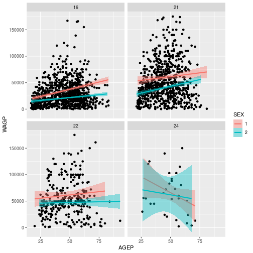
Adding facet_wrap(vars(SCHL)) creates 4 separate plots, 1 for each level of eduction attainment.
- Question
- What wage gap trend do you think is worth investigating, and how might you do it?
- Answer
- There are so many possibilities!
Review
- Call
ggplotwith data and anaesto pave the way for subsequent layers. - Add one or more
geom_*layers, possibly with data transformations. - Add
labsto annotate your plot and axes labels (not optional!). - Optionally add
scale_*,theme_*,facet_*, or other modifiers that work on underlying layers.
Additional Resources
- Data Visualization with ggplot2 RStudio Cheat Sheet
- Cookbook for R - Graphs Reference on customizations in ggplot
- Introduction to cowplot Vignette for a package with ggplot enhancements
Exercises
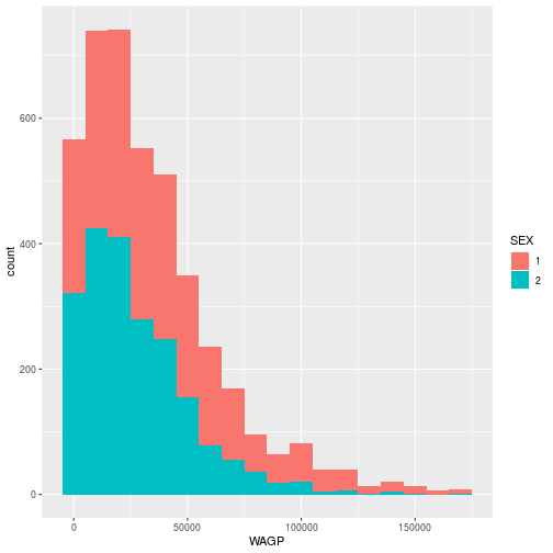
Exercise 1
Create a histogram, using a geom_histogram layer, of the wages earned by
females and males, with sex distinguished by the color of the bar’s interior. To
silence that warning you’re getting, open the help with ?geom_histogram and
determine how to explicitly set the bin width.
Exercise 2
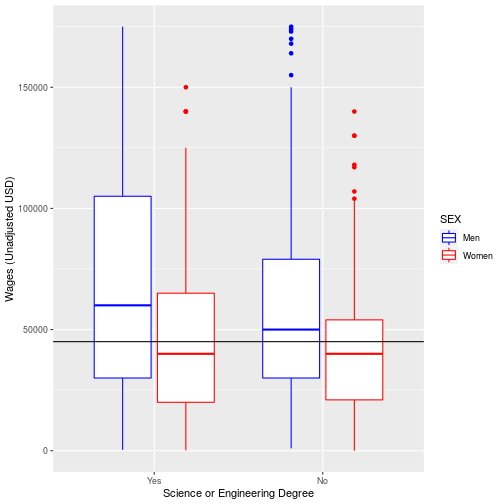
The ACS includes data for if an individual has a science or engineering degree SCIENGP. Use ggplot to show how the mean wage earned in the U.S. varies when individuals have a science or engineering degree (coded as 1) or do not (coded as 2),
showing males and females in different colors. (Hint: Baby steps! First determine what type of plot you want to use to display categorical data for SCIENGP. Then
distinguish sexes by color. You can then customize your plot labels, colors, etc.)
Explore the help file for ?geom_abline Add a horizontal line for the median wages for the data overall.
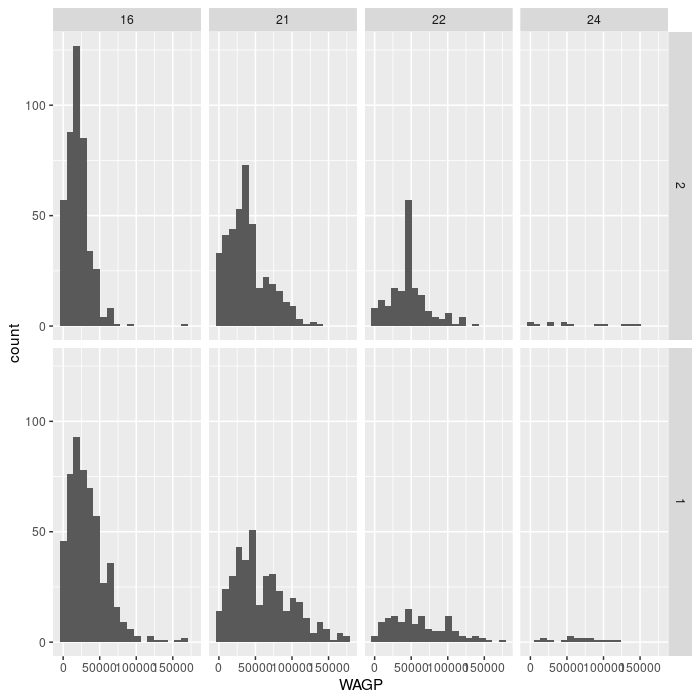
Exercise 3
The facet_grid layer (different from facet_wrap) requires an argument for
both row and column varaibles, creating a grid of panels. Create a plot with 8
facets, each displaying a single histogram of wage earned by women or men having
one of the four education attainment levels. Make the grid have 2 rows and 4
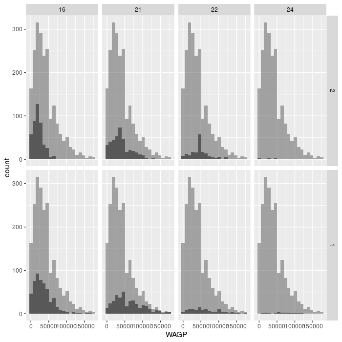
columns. Advanced challenge: add a second, partially transparent, histogram to
the background of each facet that provides a comparison to the whole population.
(Hint: the second histogram should not inherit the dataset from the ggplot
foundation.)
Solutions
ggplot(pums,
  aes(x = WAGP, fill = SEX)) +
  geom_histogram(binwidth = 10000)
ggplot(na.omit(pums), aes(x=SCIENGP, y=WAGP, color=SEX)) +
  geom_boxplot()+
  scale_color_manual(values = c('blue', 'red'),
                     labels = c('Men', 'Women')) +
  scale_x_discrete(labels = c('Yes', 'No'))+
  labs(x = "Science or Engineering Degree",
       y = "Wages (Unadjusted USD)") +
  geom_hline(aes(yintercept= median(WAGP)))
ggplot(filter_SCHL,
  aes(x = WAGP)) +
  geom_histogram(bins = 20) +
  facet_grid(vars(SEX), vars(SCHL))
For the advanced challenge, you must supply a dataset to a second gemo_histogram
that does not have the variable specified in facet_grid. Note that
facet_grid affects the entire plot, including layers added “after faceting”,
as in the solution below.
ggplot(filter_SCHL,
  aes(x = WAGP)) +
  geom_histogram(bins = 20) +
  facet_grid(vars(SEX), vars(SCHL)) +
  geom_histogram(
    bins = 20,
    data = filter_SCHL['WAGP'],
    alpha = 0.5)
If you need to catch-up before a section of code will work, just squish it's 🍅 to copy code above it into your clipboard. Then paste into your interpreter's console, run, and you'll be ready to start in on that section. Code copied by both 🍅 and 📋 will also appear below, where you can edit first, and then copy, paste, and run again.
# Nothing here yet!