Visualizing Tabular Data
Lesson 2 with Elizabeth Green
Lesson Objectives
- Meet the “grammar of graphics” for ggplot2
- Trust us: this is better than base R’s
plot - Learn to layer visual elements on top of tidy data
- Glimpse the vast collection of ggplot2 options
Specific Achievements
- Create “aesthetic mappings” between variables and geometries
- Build boxplots, scatterplots, smoothed lines and histograms
- Style plots with colors, annotate them with labels
- Repeat plots for different subsets of data
Getting Started
Let’s start by loading a few packages along with a sample dataset, which is the animals table from the Portal Project Teaching Database.
library(dplyr)
animals <- read.csv('data/animals.csv',
  na.strings = '') %>%
  select(year, species_id, sex, weight) %>%
  na.omit()
Omitting rows that have missing values for the species_id, sex, and weight columns is not strictly necessary, but it will prevent ggplot from returning missing values warnings.
Layered Graphics
As a first example, this code plots each invidual’s weight by species:
library(ggplot2)
ggplot(animals,
       aes(x = species_id, y = weight)) +
  geom_point()
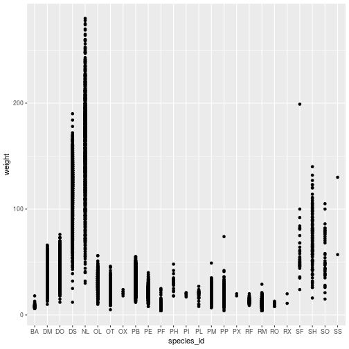
The ggplot command expects a data frame and an aesthetic mapping. The aes function creates the aesthetic, a mapping between variables in the data frame and visual elements in the plot. Here, the aesthetic maps species_id to the x-axis and weight to the y-axis.
The ggplot function by itself does not display anything until we add a geom_* layer, in this example a geom_point. Layers are literally added, with +, to the object created by the ggplot function.
Individual points are hard to distinguish in this plot. Might a boxplot be a better visualization? The only change needed is in the geom_* layer.
ggplot(animals,
       aes(x = species_id, y = weight)) +
  geom_boxplot()
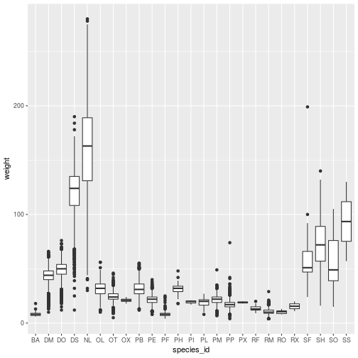
Add geom_* layers together to create a multi-layered plot:
ggplot(animals,
       aes(x = species_id, y = weight)) +
  geom_boxplot() +
  geom_point()
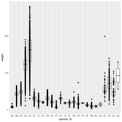
Each geom_* object accepts arguments to customize that layer. Many arguments are
common to multiple geom_* functions, such as those for adding blanket styling
to the layer.
ggplot(animals,
       aes(x = species_id, y = weight)) +
  geom_boxplot() +
  geom_point(color = 'red')
The color specification was not part of aesthetic mapping between data and
visual elements, so it applies to the entire layer.
The stat parameter, in conjunction with fun.y, provide the ability
to perform on-the-fly data transformations.
ggplot(animals,
       aes(x = species_id, y = weight)) +
  geom_boxplot() +
  geom_point(
    color = 'red',
    stat = 'summary',
    fun.y = 'mean')
The geom_point layer definition illustrates two features:
- With
stat = 'summary', the plot replaces the raw data with the result of a summary function, defined byfun.y. - Setting
color = redapplies one color to the whole layer.
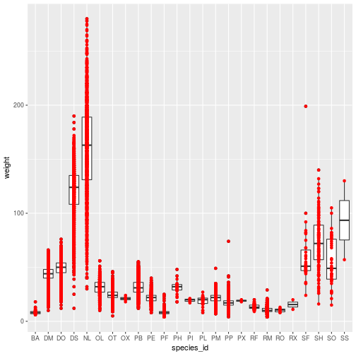
Associating color (or any attribute, like the shape of points) to a variable is
another kind of aesthetic mapping. Passing the color argument to the aes
function works quite differently than assiging color to a geom_*.
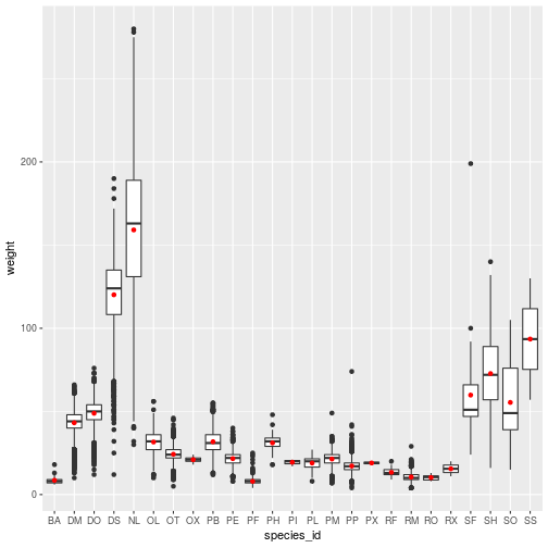
ggplot(animals,
       aes(x = species_id, y = weight,
           color = species_id)) +
  geom_boxplot() +
  geom_point(stat = 'summary',
             fun.y = 'mean')
Smooth Lines
The geom_smooth layer adds a regression line with confidence intervals (95% CI by default). The method = 'lm' parameter specifies that a linear model is used for smoothing.
Load some data you might use for a linear model with a categorical predictor of a continuous response.
levels(animals$sex) <- c('Female', 'Male')
animals_dm <- filter(animals,
  species_id == 'DM')
With a categorical predictor mapped to an aesthetic element, the geom_smooth
call will separately apply the lm method. The result hints at the significance
of the predictor.
ggplot(animals_dm,
  aes(x = year, y = weight, shape = sex)) +
  geom_point(size = 3,
    stat = 'summary', fun.y = 'mean') +
  geom_smooth(method = 'lm')
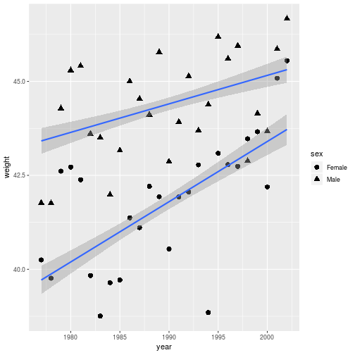
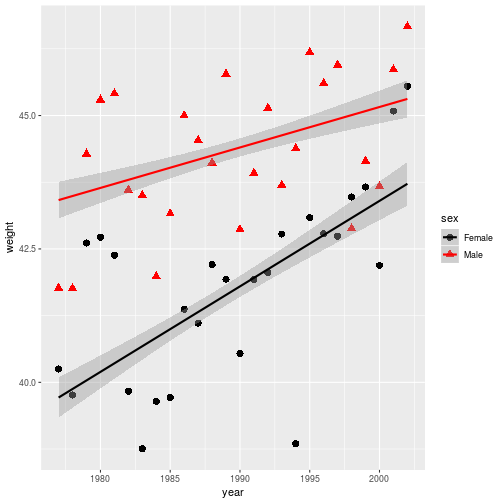
Even better would be to distinguish everything (points and lines) by color.
ggplot(animals_dm,
  aes(x = year, y = weight,
    shape = sex, color = sex)) +
  geom_point(size = 3,
    stat = 'summary', fun.y = 'mean') +
  geom_smooth(method = 'lm')

Notice that by adding aesthetic mappings in the base aesthetic (in the ggplot
command), it is applied to any layer that recognizes the parameter.
Storing and Re-plotting
The output of ggplot can be assigned to a variable. It is then possible to add
new elements to it with the + operator. We will use this method to try
different color scales for a stored plot.
year_wgt <- ggplot(animals_dm,
  aes(x = year, y = weight,
    color = sex, shape = sex)) +
  geom_point(size = 3,
    stat = 'summary',
    fun.y = 'mean') +
  geom_smooth(method = 'lm')
The plot information stored in year_wgt can be used on its own, or with
additional layers.
> year_wgt
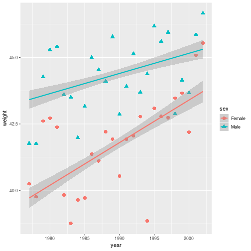
By overwriting the year_wgt variable, the stored plot gets updated with the
black and red color scale.
year_wgt <- year_wgt +
  scale_color_manual(
    values = c('black', 'red'))
> year_wgt
Figures are constructed in ggplot2 as layers of shapes, from the
axes on up through the geom_* elements. Natural file types for storing these
figures at “infinite” resolution are PDF (for print) or SVG (for online).
ggsave(filename = 'year_wgt.pdf',
       plot = year_wgt,
       width = 4, height = 3)
The plot argument is unnecessary if the target is the most recently displayed
plot. When a raster file type is necessary (e.g. a PNG, JPG, or TIFF) use the
dpi argument to specify an image resolution.
Axes, Labels and Themes
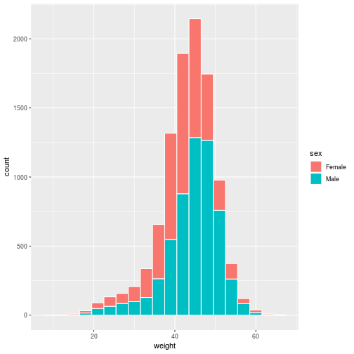
Let’s start looking at annotation and other customizations on a new geom_*,
one that creates a histogram. Due to the nature of histograms, the base
aesthetic does not require a mapping for y.
histo <- ggplot(animals_dm,
  aes(x = weight, fill = sex)) +
  geom_histogram(binwidth = 3,
    color = 'white')
> histo
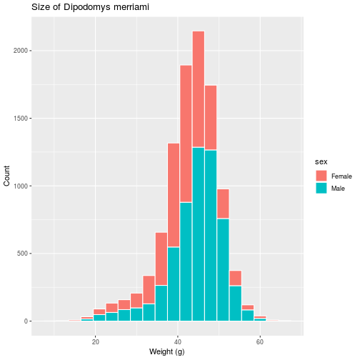
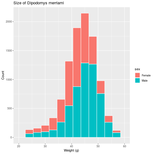
Set the title and axis labels with the labs function, which accepts names for
labeled elements in your plot (e.g. x, y, title) as arguments.
histo <- histo + labs(title =
  'Size of Dipodomys merriami',
  x = 'Weight (g)',
  y = 'Count')
> histo
For information on how to add special symbols and formatting to plot labels, see ?plotmath.
We have various functions related to the scale of each axis, i.e. the range,
breaks and any transformations of the values on the axis. Here, we use
scale_x_continuous to modify the continuous (as opposed to discrete) x-axis.
histo <- histo + scale_x_continuous(
  limits = c(20, 60),
  breaks = c(20, 30, 40, 50, 60))
> histo
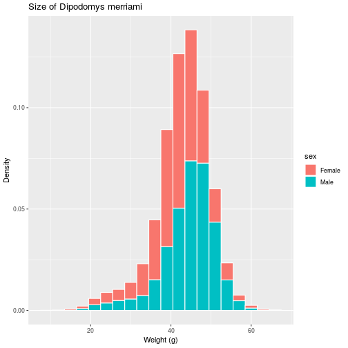
If we prefer a histogram showing probability, rather than counts, as the scale
on the vertical axis, the aesthetic itself must be modified to include this
non-default mapping for the y element.
histo <- ggplot(animals_dm,
  aes(x = weight,
      y = stat(density),
      fill = sex)) +
  geom_histogram(binwidth = 3,
    color = 'white') +
  labs(title =
    'Size of Dipodomys merriami',
    x = 'Weight (g)',
    y = 'Density')
> histo
Many plot-level options in ggplot2, from background color to font
sizes, are defined as part of “themes”. The next modification to histo changes
the base theme of the plot to theme_bw (replacing the default theme_grey)
and sets a few options manually with the theme function.
histo <- histo + theme_bw() + theme(
  legend.position = c(0.2, 0.5),
  plot.title = element_text(
    face = 'bold', hjust = 0.5),
  axis.title.y = element_text(
    size = 13, hjust = 0.1),
  axis.title.x = element_text(
    size = 13, hjust = 0.1))
> histo
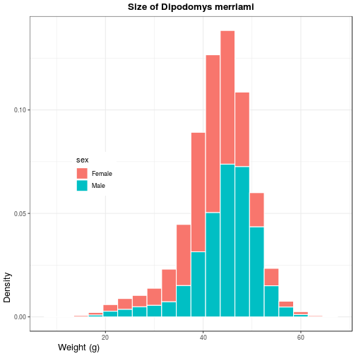
Use ?theme for a list of available theme options. Note that position (both
legend.position and hjust for horizontal justification) should be given as a
proportion of the plot window (i.e. between 0 and 1).
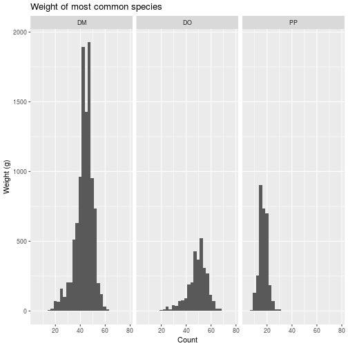
Facets
To conclude this overview of ggplot2, we’ll apply the same plotting
instructions to different subsets of the data, creating panels or “facets”. The
facet_wrap function takes a vars argument that, like the aes function
relates a variable in the dataset to a visual element, the panels.
animals_common <- filter(animals,
  species_id %in% c('DM', 'PP', 'DO'))
faceted <- ggplot(
  animals_common, aes(x = weight)) +
  geom_histogram() +
  facet_wrap(vars(species_id)) +
  labs(title =
       'Weight of most common species',
       x = 'Count',
       y = 'Weight (g)')
> faceted
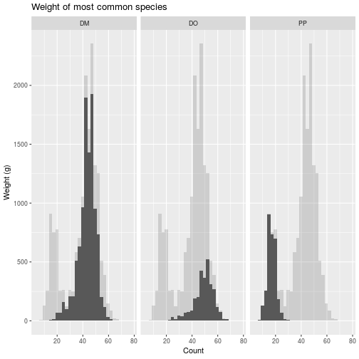
The un-grouped data may be added as a layer on each panel, but you have to drop
the grouping variable (i.e. month).
faceted_all <- faceted +
  geom_histogram(data =
    select(animals_common, -species_id),
    alpha = 0.2)
> faceted_all
Review
- Call
ggplotwith parametersdataandaespaving the way for subsequent layers. - Add one or more
geom_*layers, possibly with data transformations. - Add
labsto annotate your plot and axes labels. - Optionally, add
scale_*,theme_*,facet_*, or other modifiers that work on underlying layers.
Additional Resources
- Data Visualization with ggplot2 RStudio Cheat Sheet
- Cookbook for R - Graphs Reference on customizations in ggplot
- Introduction to cowplot Vignette for a package with ggplot enhancements
Exercises
Exercise 1
Use dplyr to filter down to the animals with species_id equal to DM. Use
ggplot to show how the mean weight of this species changes each year, showing
males and females in different colors. (Hint: Baby steps! Start with a
scatterplot of weight by year. Then expand your code to plot only the means.
Then try to distinguish sexes.)
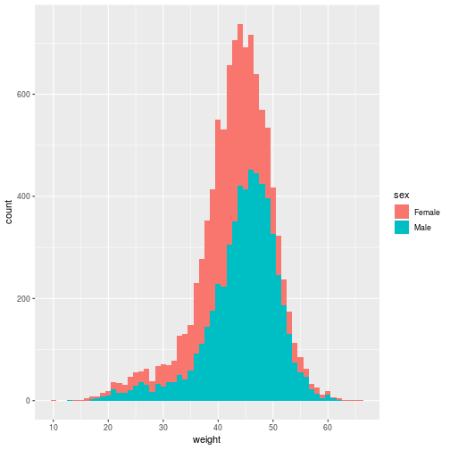
Exercise 2
Create a histogram, using a geom_histogram layer, of the weights of
individuals of species DM and divide the data by sex. Note that instead of using
color in the aesthetic, you’ll use fill to distinguish the sexes. To silence
that warning, open the help with ?geom_histogram and determine how to
explicitly set the bin width.
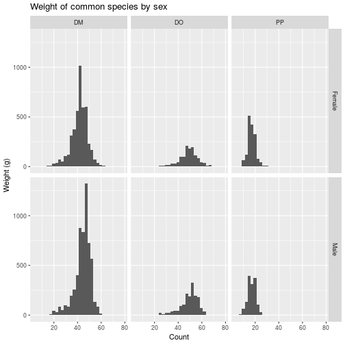
Exercise 3
The facet_grid layer (different from facet_wrap) requires an argument for
both row and column varaibles, creating a grid of panels. For these three common
animals, create facets in the weight histogram along two categorical variables,
with a row for each sex and a column for each species.
Solutions
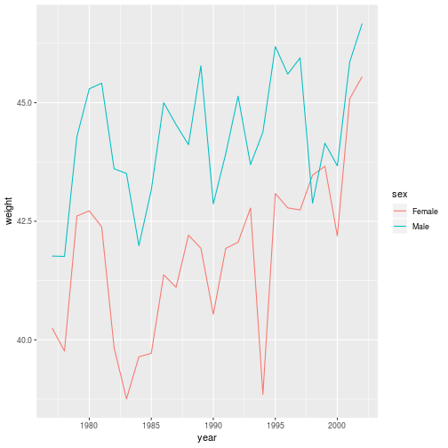
Solution 1
animals_dm <- filter(animals, species_id == 'DM')
ggplot(animals_dm,
       aes(x = year, y = weight, color = sex)) +
  geom_line(stat = 'summary',
            fun.y = 'mean')
Solution 2
filter(animals, species_id == 'DM') %>%
  ggplot(aes(x = weight, fill = sex)) +
  geom_histogram(binwidth = 1)
Solution 3
ggplot(animals_common,
       aes(x = weight)) +
  geom_histogram() +
  facet_grid(vars(sex), vars(species_id)) +
  labs(title = 'Weight of common species by sex',
       x = 'Count',
       y = 'Weight (g)')
If you need to catch-up before a section of code will work, just squish it's 🍅 to copy code above it into your clipboard. Then paste into your interpreter's console, run, and you'll be ready to start in on that section. Code copied by both 🍅 and 📋 will also appear below, where you can edit first, and then copy, paste, and run again.
# Nothing here yet!