Maps in R
Handouts for this lesson need to be saved on your computer. Download and unzip this material into the directory (a.k.a. folder) where you plan to work.
Goals
Over time, the R community has produced a collection of spatial analysis and visualization packages, giving current R users the ability to implement various tasks that previously required to specialized Geographic Information System (GIS) software.
This lesson provides a quick tour of popular tools available to read and display spatial data in R. These can be useful whether you want to quickly explore a dataset or to produce high-quality maps for print and web publications. Like for other types of figures, building maps with scripts can take some time at first, but that investment will quickly pay off in terms of reproducibility and re-use value.
Spatial data types
All types of spatial data belong in one of two main categories: vectors (points, lines and polygons) or rasters (grids of pixels).
| Raster | Vector |
|---|---|
| matrix | table |
| surface | shape |
| pixels | features |
| bands | attributes |
Some raster file formats: GeoTIFF, netCDF
Some vector file formats: shapefiles, WKT, GeoJSON
Reading shapefiles
Vector data in shapefiles can be read via the readOGR function in rgdal,
which is a package linking R to the open source Geospatial Data Abstraction
Library (GDAL).
Here, we read a shapefile corresponding to county boundaries for the state of Maryland. This data was extracted from the full county boundaries shapefile available on the US census website.
library(rgdal)
counties_md <- readOGR('data/cb_2016_md_county_5m',
                       'cb_2016_md_county_5m')
Note that the first argument to readOGR is the path of the shapefile
whereas the second argument is the layer name; for simple shapefiles, it is
usually identical to the file name.
The shapefile is read as a SpatialPolygonsDataFrame object, which contains
both a list of 24 county (multi)polygons (counties_md@polygons), as well as a
data frame (counties_md@data) where each row stores the attributes of the
corresponding county.
> summary(counties_md)
Object of class SpatialPolygonsDataFrame
Coordinates:
        min       max
x -79.48765 -75.04894
y  37.91172  39.72312
Is projected: FALSE
proj4string : [+proj=longlat +datum=NAD83 +no_defs]
Data attributes:
   STATEFP            COUNTYFP           COUNTYNS           AFFGEOID
 Length:24          Length:24          Length:24          Length:24
 Class :character   Class :character   Class :character   Class :character
 Mode  :character   Mode  :character   Mode  :character   Mode  :character


    GEOID               NAME               LSAD               ALAND
 Length:24          Length:24          Length:24          Min.   :2.096e+08
 Class :character   Class :character   Class :character   1st Qu.:8.279e+08
 Mode  :character   Mode  :character   Mode  :character   Median :1.087e+09
                                                          Mean   :1.048e+09
                                                          3rd Qu.:1.222e+09
                                                          Max.   :1.711e+09
     AWATER
 Min.   :6.346e+06
 1st Qu.:2.418e+07
 Median :2.007e+08
 Mean   :2.910e+08
 3rd Qu.:4.558e+08
 Max.   :1.145e+09
Basic spatial plots
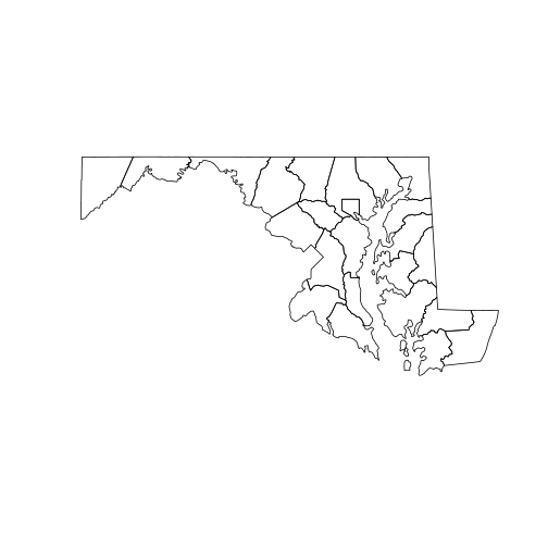
To display the spatial features (points, lines or polygons) in a Spatial object, you can simply use the plot function.
plot(counties_md)
To show how multiple spatial layers can be superposed in the same plot,
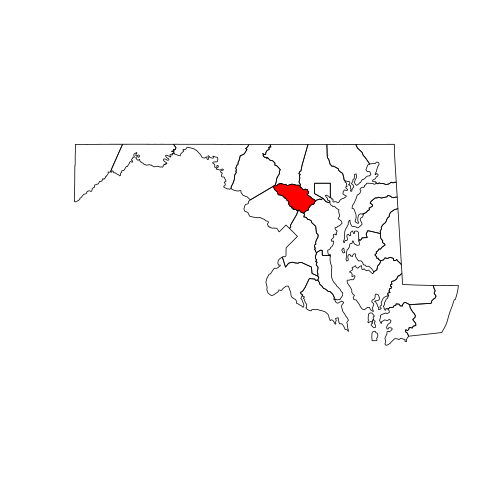
we will create a new SpatialPolygonsDataFrame with a single county selected
by name. Note that we can subset counties_md just like a regular data frame.
To add a new layer to an existing plot, use the add = TRUE argument.
howard <- counties_md[counties_md[["NAME"]] == "Howard", ]
plot(counties_md)
plot(howard, col = "red", add = TRUE)
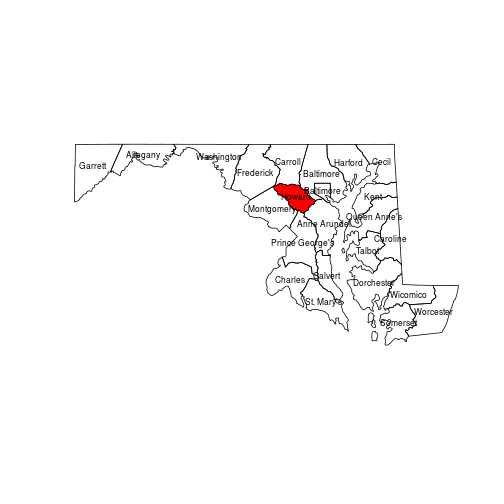
Other base R functions, such as text, always add elements to an existing plot.
In the code below, note that calling coordinates on a polygon object returns
the center point of each polygon.
plot(counties_md)
plot(howard, col = "red", add = TRUE)
text(coordinates(counties_md),
     labels = counties_md[["NAME"]],
     cex = 0.7)
Exercise
Starting from a fresh map, print numbers on each county in order of the smallest
(1) to largest (24) in land area (“ALAND” attribute).
Hint: Use rank(x) to get ranks from a numeric vector x.
Reading rasters
While vector spatial layers are composed of geometrical objects defined by their vertices, raster layers are grids of pixels with attached values.
We start by loading the raster package in R and importing a raster file with the eponymous raster function. This file is a portion of the National Land Cover Database, which we already cropped and reduced to a lower resolution in order to speed up processing time for this tutorial.
library(raster)
nlcd <- raster("data/nlcd_agg.grd")
A raster is fundamentally a data matrix with associated spatial properties (e.g. extent, resolution and projection) that allow its values to be mapped onto geographical space. You can view these key properties – the raster’s metadata – by typing the object name in the console.
> nlcd
class      : RasterLayer
dimensions : 2514, 3004, 7552056  (nrow, ncol, ncell)
resolution : 150, 150  (x, y)
extent     : 1394535, 1845135, 1724415, 2101515  (xmin, xmax, ymin, ymax)
crs        : +proj=aea +lat_1=29.5 +lat_2=45.5 +lat_0=23 +lon_0=-96 +x_0=0 +y_0=0 +ellps=GRS80 +towgs84=0,0,0,0,0,0,0 +units=m +no_defs
source     : /nfs/public-data/training/nlcd_agg.grd
names      : nlcd_2011_landcover_2011_edition_2014_03_31
values     : 0, 95  (min, max)
attributes :
        ID      COUNT Red Green Blue Land.Cover.Class Opacity
 from:   0 7854240512   0     0    0     Unclassified       1
  to : 255          0   0     0    0                        0
The values in raster cells range from 0 to 255, yet land cover is a categorical variable. The mapping of numbers to categories can be found in the raster’s attribute table:
attr_table <- nlcd@data@attributes[[1]]
Each land cover category has a distinct color specified by the “Red”, “Green” and “Blue” columns.
We can visualize the whole raster with plot.
plot(nlcd)
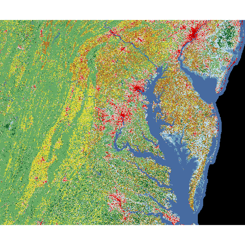
At this point, we might want to superpose the county boundaries on top of the raster image. However, the following instruction does not show the county polygons. Why not?
> plot(counties_md, add = TRUE)
Reading and changing projections
In order for two spatial objects to be comparable, they must be represented in the same coordinate reference system. This can be a geographic coordinate system or a projected coordinate system.
A geographic coordinate system (GCS) represents each point on Earth by two angular coordinates, a longitude and a latitude. In effect, it approximates the irregular “sea level” surface of the Earth (the geoid) by an ellipsoid (a sphere flattened at the poles). The specification of this ellipsoid, or datum, has changed over times; current global maps are generally based on the WGS 84 datum, but other systems are in use for older or regional maps.
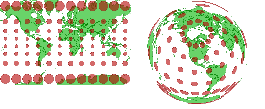
A projected coordinated system associates angular coordinates to points on a plane, in order to produce two-dimensional maps. No such projection can faithfully reproduce the three-dimensional relationship between any set of points on the globe. For example, the Mercator projection (left) preserves angles, which is useful for navigation, but it greatly inflates areas at the poles. The Lambert equal-area projection (right) preserves areas at the cost of shape distortion away from its center.
Web-based tiled map services like Google Maps use a simplified, less accurate Mercator projection (Web Mercator) to optimize rendering speed.
Projection String
Coordinate systems in R are described in a standard PROJ.4 string format.
The counties_md polygons layer uses a geographic coordinate system (“+proj=longlat”) based on the NAD83 datum, whereas the nlcd has an Albers equal-area projection (“+proj=aea”).
> proj4string(counties_md)
[1] "+proj=longlat +datum=NAD83 +no_defs "
> proj4string(nlcd)
[1] "+proj=aea +lat_1=29.5 +lat_2=45.5 +lat_0=23 +lon_0=-96 +x_0=0 +y_0=0 +ellps=GRS80 +towgs84=0,0,0,0,0,0,0 +units=m +no_defs"
- Question
- Why is the equal-area projection useful for a land cover dataset?
- Answer
- Because each cell has the same area, the proportion of cells with a given land cover class is a good estimate of the fraction of total land area covered by that class
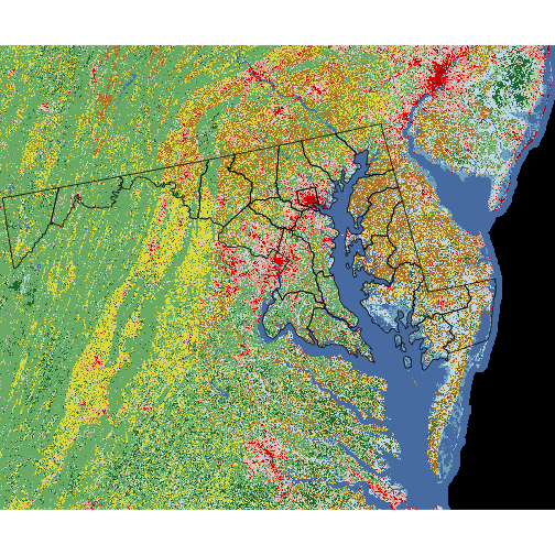
Returning to our original problem, we can superpose the two layers by first converting counties_md to the same projection as nlcd. The spTransform function performs this
operation.
counties_proj <- spTransform(counties_md,
                             proj4string(nlcd))
plot(nlcd)
plot(counties_proj, add = TRUE)
Masking a raster
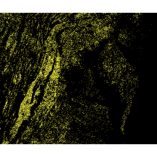
To conclude this presentation of rasters, we introduce the mask function. Masking a raster means removing some of its data (i.e. setting it to NA) based on a logical condition.
For example, the masking layer nlcd == 81 returns TRUE for cells with land cover class 81 (pasture) and FALSE otherwise. With the setting maskvalue = FALSE, the code chunk below masks any non-pasture cells and plots the resulting raster.
pasture <- mask(nlcd, nlcd == 81, maskvalue = FALSE)
plot(pasture)
Exercise
Create and plot a mask for a different type of land cover.
You may consult attr_table to find the numeric ID matching a specific land cover class.
Adding data to maps
The tmap (“thematic map”) package simplifies map-based visualization of data attributes associated with a given shapefile. Its logic and syntax are particularly easy to learn for those users already familiar with the popular graphics package ggplot2.
Quick mapping with qtmap
Like the qplot function in ggplot2, qtmap serves to make a quick, less customized map from a single line of code. Its first argument is a spatial object forming the base of the map.
library(tmap)
qtm(counties_proj)
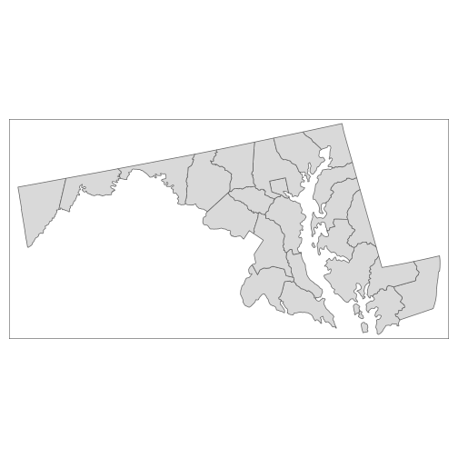
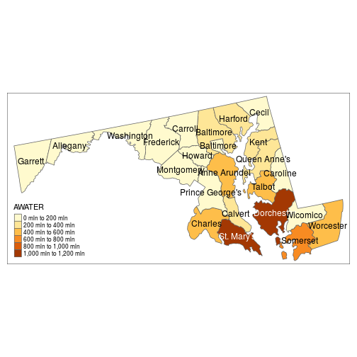
If the shapefile has associated data, its column names (as quoted strings) can be mapped to graphical elements of the plot. In the example below, the “fill” color of counties depends on their water area, and county names are shown at the center of each polygon.
qtm(counties_proj, fill = "AWATER", text = "NAME")
Layered thematic maps (ggplot style)
For more detailed maps, you can add multiple layers defined by tm_ functions. In the code below, tm_shape sets the spatial object from which the successive layers are derived; tm_borders adds the polygon outlines; tm_fill and tm_text define the same graphical elements as in our previous map, with additional arguments specifying the legend title and text size.
map1 <- tm_shape(counties_proj) +
            tm_borders() +
            tm_fill("AWATER", title = "Water Area (sq. m)") +
            tm_text("NAME", size = 0.7)
> map1

Since we saved our thematic map in a variable map1, we can recall it and add more map elements, as shown below.
map1 +
    tm_style("classic", legend.frame = TRUE) +
    tm_scale_bar(position = c("left", "top"))
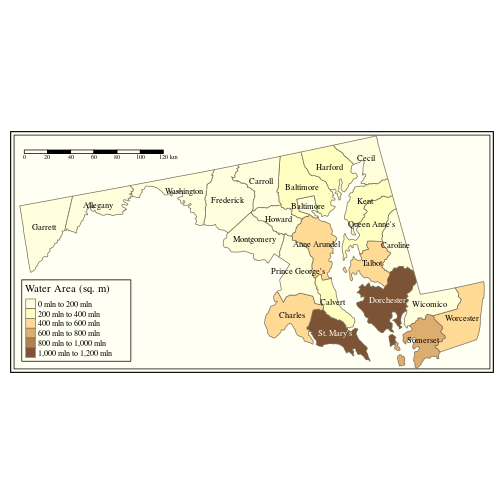
Note that tm_style changes the overall theme of the plot.
Exercise
Color scales in tmap are divided into bins by default.
Consult the help file ?tm_fill to find which argument controls how the scale is divided. Can you change it to a continuous gradient instead of bins?
Note that a single thematic map can combine data from multiple vector or raster objects. You can find more tmap examples in the tmap: get started! R vignette.
Interactive maps with Leaflet
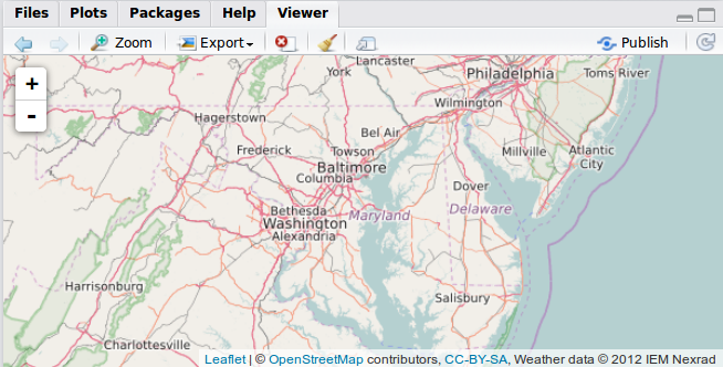
The leaflet package is a R interface to the leaflet JavaScript library. It produces interactive maps (with controls to zoom, pan and toggle layers) combining local data with base layers from web mapping services.
The leaflet() function creates an empty leaflet map to which layers can be added using the pipe (%>%) operator. The addTiles functions adds a base tiled map; by default, it imports tiles from OpenStreetMap. We center and zoom the map with setView.
library(leaflet)
imap <- leaflet() %>%
            addTiles() %>%
            setView(lng = -76.505206, lat = 38.9767231,
                    zoom = 7)
imap
Switch to the “Viewer” tab in RStudio to see the result.
To show how leaflet can access open data from various web mapping services (WMS), we add real-time weather radar data from the Iowa Environmental Mesonet.
imap %>%
    addWMSTiles(
        "http://mesonet.agron.iastate.edu/cgi-bin/wms/nexrad/n0r.cgi",
        layers = "nexrad-n0r-900913", group = "base_reflect",
        options = WMSTileOptions(format = "image/png", transparent = TRUE),
        attribution = "Weather data © 2012 IEM Nexrad"
    )
Use the map controls to zoom away from the current location and find ongoing storm events.
Leaflet maps in Shiny
Since leaflet outputs a JavaScript object, it integrates particularly well with Shiny applications. Leaflet maps can be embedded in Shiny with the leafletOutput (UI-side) and renderLeaflet (server-side) functions.
Open the worksheet-3.R handout. The first part of the code loads libraries, then imports the counties_md shapefile and nlcd_proj raster. The latter has been pre-projected to Web Mercator for compatibility with leaflet.
While leaflet performs some projection conversions automatically, fixing raster projections in advance can greatly reduce the app loading time.
# Libraries
library(rgdal)
library(raster)
library(leaflet)

# Load data
counties_md <- readOGR('data/cb_2016_md_county_5m', 'cb_2016_md_county_5m')
nlcd_proj <- raster("data/nlcd_proj.grd")
Defining the UI
For the sake of this demonstration, our user interface will be composed of a single leafletOutput object inside a fluidPage (a flexible Shiny layout).
ui <- fluidPage(title = "Interactive Map",
    leafletOutput("sesync_map")
)
Defining the server
In the server function, we first specify that the output will be generated by a renderLeaflet.
server <- function(input, output) {
    output[["sesync_map"]] <- renderLeaflet({
The following setView and addTiles command produce the same base map as earlier. We then add a point marker at the location of SESYNc, with a popup description
        addMarkers(lng = -76.505206, lat = 38.9767231,
                   popup = "SESYNC") %>%
Adding polygon and raster layers
We then add the county outlines with addPolygons and the land cover information with addRasterImage.
        addPolygons(data = counties_md, fill = FALSE)  %>%
        addRasterImage(nlcd_proj, opacity = 0.7,
                       project = FALSE)
Here is the complete server function. You are now ready to run the app.
server <- function(input, output) {
    output[["sesync_map"]] <- renderLeaflet({
        leaflet() %>%
            setView(lng = -76.505206, lat = 38.9767231,
                    zoom = 8) %>%
            addTiles() %>%
            addMarkers(lng = -76.505206, lat = 38.9767231,
                       popup = "SESYNC") %>%
            addPolygons(data = counties_md, fill = FALSE)  %>%
            addRasterImage(nlcd_proj, opacity = 0.7,
                           project = FALSE)
    })
}
Map layer controls
We complete this lesson by adding some interactive control to toggle specific layers on the map.
Open the data/cb_2016_md_county_5m handout. It is identical to the previous app code, except for a few additional lines in the server function.
First, notice that we assigned the polygons layer to a group named “MD counties”.
        addPolygons(data = counties_md, fill = FALSE,
                    group = "MD counties") %>%
We add two separate raster layers, each produced by masking all but a single land cover class. We put each layer in a group named for its land cover class and assign it a color.
        addRasterImage(mask(nlcd_proj, nlcd_proj == 41,
                            maskvalue = FALSE),
                       group = "Deciduous Forest",
                       colors = "green", project = FALSE) %>%
        addRasterImage(mask(nlcd_proj, nlcd_proj == 81,
                            maskvalue = FALSE),
                       group = "Pasture",
                       colors = "yellow", project = FALSE) %>%
We then call addLayersControl to add controls that toggle between the two rasters (baseGroups) with the option of overlaying the county polygons (overlayGroups).
        addLayersControl(baseGroups = c("Deciduous Forest",
                                        "Pasture"),
                         overlayGroups = c("MD counties"))
You can now run the app and try the layer controls.
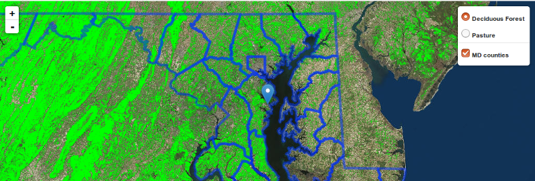
In addition to these controls embedded in the map, it is possible to modify a map based on other input objects in the Shiny app. See the SuperZip app in the Shiny gallery for a full example.
If you need to catch-up before a section of code will work, just squish it's 🍅 to copy code above it into your clipboard. Then paste into your interpreter's console, run, and you'll be ready to start in on that section. Code copied by both 🍅 and 📋 will also appear below, where you can edit first, and then copy, paste, and run again.
# Nothing here yet!