
There are a variety of visualization options available to help scientific teams create and share a collective vision of their research project. The development of these visualizations can promote deep learning and engagement by transcending verbal and written boundaries across diverse perspectives within a team. These visuals allow groups to communicate complex socio-environmental concepts among the team, scientific community and public sphere.
The choice of visualization tools for a scientific team depends on the goals and outcomes that the visual aims to achieve within a research project. Here are some different visualization options to help teams throughout all stages of the research process:
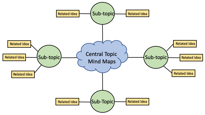
Mind maps allow research teams to create a free-form and non-linear visual to explore a concept and its relating ideas. These maps allow teams to brainstorm a topic and are relatively informal.
The map is constructed with a topic or image in the center which is connected to relating thoughts or information that expand outwardly using a radial hierarchy. Commonly, visual elements can be employed throughout the mind map such as color coding, pictures and diagrams that help to build conceptual relationships and aid in comprehension.
Stage of Research Process:
Mind mapping is most commonly used during the beginning stages of a project. However, it is not limited to the start of a research endeavor. This active brainstorming process can be useful at any stage where the team feels stuck, is looking to bring a new perspective to the problem, or may be searching for an opportunity to generate new and unexpected ideas.
Advantages:
This is a creative and unstructured way of brainstorming that is relatively quick and easy to learn.
Disadvantages:
Mind maps are limited in their ability to articulate highly complex relationships. Therefore, it is useful for teams trying to distill a unique concept but they are not designed to explore the interrelatedness between various concepts.
Resources:
The science of mind mapping: a visual way to make sense of the world
Choosing and using Mind Maps and Concept Maps
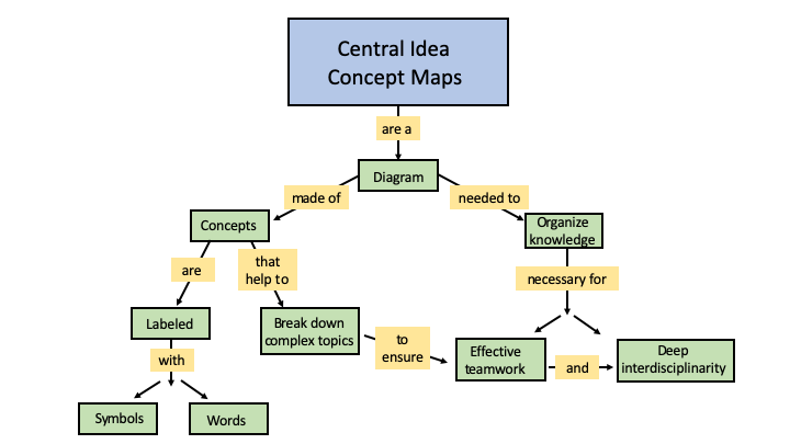
Concept maps are linear and structured visualizations used by teams to outline the relationships between various concepts central to a research question. These maps provide a more precise look at the linkages between related concepts in a formally organized way.
A concept map begins with a word or idea related to a focus question that the diagram aims to answer. The map then subsequently lays out all related concepts that are enclosed in circles or square boxes. These relational concepts are connected through arrows defined by linking text (prepositional phrases) that explain how each idea is associated to one another. These linking relationships can be hierarchical (downward arrows) or they can be moving in all directions.
Stage of Research Process:
Concept maps are useful as part of a project’s initial scoping activities but are also ever-evolving. As the project develops and new linkages are discovered it is important to update the concept map so it continues to serve the project from beginning to end.
Advantages:
Its ability to display relational links between relevant concepts can be especially useful for capturing the complex dynamics and systems relevant to socio-environmental research.
Disadvantages:
Concept maps are a rigorous and structured tool that have a learning curve. In addition, although they are designed to explicitly identify related concepts, these maps are limited in their ability to describe the complexity of those relationships in detail.
Resources:
The Theory Underlying Concept Maps
Concept mapping, mind mapping and argument mapping: what are the differences and do they matter?
An infographic is a collection of charts, diagrams, or illustrations that visually present information in a clear and attention-grabbing way. Infographics are especially useful for communicating complex ideas to an audience who may not have expertise in that subject. Research teams use infographics as a science communications product to present their research problem, key findings, outcomes and/or goals.
Here are some guiding questions to consider when creating an infographic:
The answers to these questions will help your team outline the foundation of your infographic and are key to communicating socio-environmental concepts in a visual format.
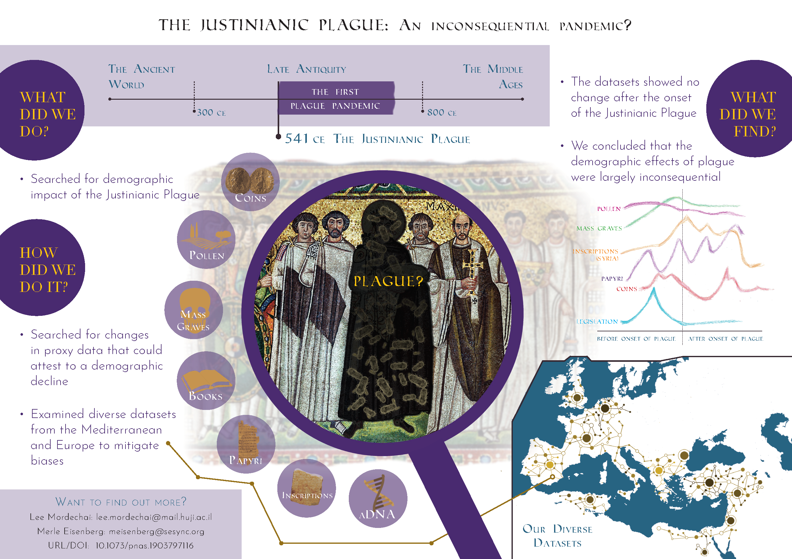 This infographic on the Justinianic Plague uses visual storytelling to share the outcomes of a project led by SESYNC researchers.
Stage of Research Process:
It is helpful for teams to develop a communications strategy at the start of their project rather than as an end stage activity. The choice to create an infographic at the outset of the research project will help to direct ideas and inspiration for the final product.
Advantages:
An infographic can bring your research to life and convey complex topics to an audience who may not have expertise in that subject. Therefore, it is great for building bridges between science, community and action.
Disadvantages:
It is time consuming to create a high-quality infographic and it requires experience with or interest in learning about design and science communication.
Resources:
Example Teaching Infographic
Example System Infographic
SESYNC’s Communications & Broader Engagement Toolkit
How to make an infographic in PowerPoint
Although the popularity of displaying complex information visually is not new, the development of user-friendly software tools to create maps and graphics easily has been rapidly expanding. The creation of these visuals using software means that they are more easily updated, reproduced and shared widely.
Here are some popular software options to consider:
| Software | Visualization Options | Accessibility | User Experience |
|---|---|---|---|
| PowerPoint | Maps, Diagrams & Infographics | Microsoft 365 | User friendly |
| Adobe Illustrator, InDesign, & Photoshop |
Maps, Diagrams & Infographics | Adobe Suite Products | Requires Familiarity with Adobe Products |
| R R Package: DiagrammeR |
Maps & Diagrams | Open Access | Requires Coding Experience |
| Canva | Maps, Diagrams & Infographics | Web Based | User Friendly |
| GitMind | Maps | Web Based | User Friendly |
| Cmap | Maps | Web Based | User Friendly |
If you’re planning to use R to create a diagram or map with DiagrammeR, check out SESYNC’s post on Creating Visualizations with DiagrammeR.
The options listed above are just some possible software tools that can be used to create visualizations. Many of these software options can be accessed through your home institution. Each offers varying levels of difficulty depending on a user’s prior experience and comfort level working with these platforms.
For questions about using open source software for visualizations, please contact cyberhelp@sesync.org.
It may be important for your visualization to include images that help illustrate your visual’s narrative. Here are some resources for science relevant royalty free images: