Vector Operations in R
Lead Poisoning in Syracuse
Handouts for this lesson need to be saved on your computer. Download and unzip this material into the directory (a.k.a. folder) where you plan to work.
Introduction
Vector data is a way to represent features on Earth’s surface, which can be points (e.g. the locations of ice cream shops), polygons (e.g. the boundaries of countries), or lines (e.g. streets or rivers). This lesson is a whirlwind tour through a set of tools in R that we can use to manipulate vector data and do data analysis on them to uncover spatial patterns.
The example dataset in this lesson is a set of measurements of soil lead levels in the city of Syracuse, New York, collected as part of a study investigating the relationship between background lead levels in the environment and lead levels in children’s blood. As a geospatial analyst and EPA consultant for the city of Syracuse, your task is to investigate the relationship between metal concentration (in particular lead) and population. In particular, research suggests higher concentration of metals in minorities.
Lesson Objectives
- Dive into scripting vector data operations
- Manipulate spatial feature collections like data frames
- Address autocorrelation in point data
- Understand the basics of spatial regression
Specific Achievements
- Read CSVs and shapefiles
- Intersect and dissolve geometries
- Smooth point data with Kriging
- Include autocorrelation in a regression on polygon data
Simple Features
In this section, we will perform multiple operations to explore the datasets,
including soil lead concentration data (points) and census data (polygons
representing block groups and census tracts).
We will manipulate the datasets provided to join information using common table keys,
spatially aggregate the block group data to the census tract level,
and visualize vector spatial data with plot and ggplot commands for sf objects.
A standardized set of geometric shapes are the essence of vector data. The sf package puts sets of shapes in a tabular structure so that we can manipulate and analyze them.
library(sf)

lead <- read.csv('data/SYR_soil_PB.csv')
We read in a data frame with point coordinates called lead from an external CSV file,
then create an sf object from the data frame.
We use st_as_sf() with the coords argument to specify
which columns represent the x and y coordinates of each point.
The CRS must be specified with the argument crs via EPSG integer or proj4 string.
lead <- st_as_sf(lead,
  coords = c('x', 'y'),
  crs = 32618)
The lead data frame now has a “simple feature column” called geometry,
which st_as_sf creates from a CRS and a geometry type.
Each element of the simple feature column is a simple feature geometry, here
created from the "x" and "y" elements of a given feature.
In this case, st_as_sf creates a point geometry because we supplied a
single x and y coordinate for each feature, but vector features
can be points, lines, or polygons.
> lead
Simple feature collection with 3149 features and 2 fields
Geometry type: POINT
Dimension:     XY
Bounding box:  xmin: 401993 ymin: 4759765 xmax: 412469 ymax: 4770955
CRS:           EPSG:32618
First 10 features:
   ID      ppm                 geometry
1   0 3.890648 POINT (408164.3 4762321)
2   1 4.899391 POINT (405914.9 4767394)
3   2 4.434912   POINT (405724 4767706)
4   3 5.285548 POINT (406702.8 4769201)
5   4 5.295919 POINT (405392.3 4765598)
6   5 4.681277 POINT (405644.1 4762037)
7   6 3.364148 POINT (409183.1 4763057)
8   7 4.096946 POINT (407945.4 4770014)
9   8 4.689880 POINT (406341.4 4762603)
10  9 5.422257 POINT (404638.1 4767636)
| geometry | description |
|---|---|
st_point |
a single point |
st_linestring |
sequence of points connected by straight, non-self-intersecting line pieces |
st_polygon |
one [or more] sequences of points in a closed, non-self-intersecting ring [with holes] |
st_multi* |
sequence of *, either point, linestring, or polygon |
Now that our data frame is a simple feature object, calling
functions like print and plot will use methods introduced by the sf package.
For example, the print method we just used automatically shows the CRS and truncates the
number of records displayed.
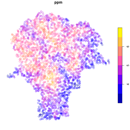
Using the plot method, the data are easily displayed as a map.
Here, the points are colored by lead concentration (ppm).
plot(lead['ppm'])
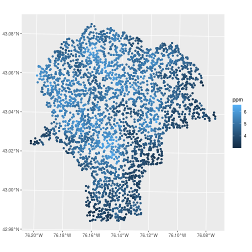
For ggplot2 figures, use geom_sf to draw maps. In the aes mapping for feature collections,
the x and y variables are automatically assigned to the geometry column,
while other attributes can be assigned to visual elements like fill or color.
library(ggplot2)

ggplot(data = lead,
       mapping = aes(color = ppm)) +
  geom_sf()
Feature Collections
More complicated geometries are usually not stored in CSV files, but they are
usually still read as tabular data. We will see that the similarity of feature
collections to non-spatial tabular data goes quite far; the usual data
manipulations done on tabular data work just as well on sf objects.
Here, we read the boundaries of the Census block groups
in the city of Syracuse from a shapefile.
blockgroups <- st_read('data/bg_00')
Reading layer `bg_00' from data source `/nfs/public-data/training/bg_00' using driver `ESRI Shapefile'
Simple feature collection with 147 features and 3 fields
Geometry type: POLYGON
Dimension:     XY
Bounding box:  xmin: 401938.3 ymin: 4759734 xmax: 412486.4 ymax: 4771049
CRS:           32618
The geometry column contains projected UTM coordinates of the polygon vertices.
Also note the table dimensions show that there are 147 features in the collection.
> blockgroups
Simple feature collection with 147 features and 3 fields
Geometry type: POLYGON
Dimension:     XY
Bounding box:  xmin: 401938.3 ymin: 4759734 xmax: 412486.4 ymax: 4771049
CRS:           32618
First 10 features:
        BKG_KEY Shape_Leng Shape_Area                       geometry
1  360670001001  13520.233  6135183.6 POLYGON ((403476.4 4767682,...
2  360670003002   2547.130   301840.0 POLYGON ((406271.7 4770188,...
3  360670003001   2678.046   250998.4 POLYGON ((406730.3 4770235,...
4  360670002001   3391.920   656275.6 POLYGON ((406436.1 4770029,...
5  360670004004   2224.179   301085.7 POLYGON ((407469 4770033, 4...
6  360670004001   3263.257   606494.9 POLYGON ((408398.6 4769564,...
7  360670004003   2878.404   274532.3 POLYGON ((407477.4 4769773,...
8  360670004002   3605.653   331034.9 POLYGON ((407486 4769507, 4...
9  360670010001   2950.688   376786.4 POLYGON ((410704.4 4769103,...
10 360670010003   2868.260   265835.7 POLYGON ((409318.3 4769203,...
Simple feature collections are data frames.
> class(blockgroups)
[1] "sf" "data.frame"
The blockgroups object is a data.frame, but it also has the class attribute
of sf. This additional class extends the data.frame class in ways useful for
feature collection. For instance, the geometry column becomes “sticky” in most
table operations, like subsetting. This means that the geometry column is retained
even if it is not explicitly named.
> blockgroups[1:5, 'BKG_KEY']
Simple feature collection with 5 features and 1 field
Geometry type: POLYGON
Dimension:     XY
Bounding box:  xmin: 402304.2 ymin: 4767421 xmax: 407469 ymax: 4771049
CRS:           32618
       BKG_KEY                       geometry
1 360670001001 POLYGON ((403476.4 4767682,...
2 360670003002 POLYGON ((406271.7 4770188,...
3 360670003001 POLYGON ((406730.3 4770235,...
4 360670002001 POLYGON ((406436.1 4770029,...
5 360670004004 POLYGON ((407469 4770033, 4...
Table Operations
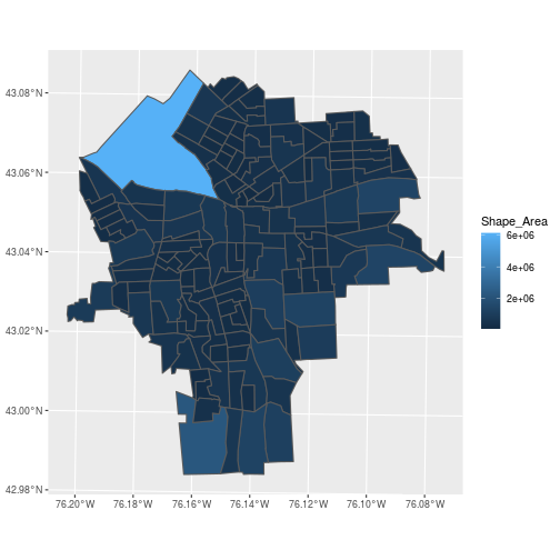
We can plot the polygon features using ggplot2 or do common data wrangling operations:
- plot
- merge or join
- “split-apply-combine” or group-by and summarize
> ggplot(blockgroups,
+        aes(fill = Shape_Area)) +
+   geom_sf()
Merging with a regular data frame is done by normal merging on non-spatial columns found in both tables.
library(dplyr)
Attaching package: 'dplyr'
The following objects are masked from 'package:stats':

    filter, lag
The following objects are masked from 'package:base':

    intersect, setdiff, setequal, union
census <- read.csv('data/SYR_census.csv')
census <- mutate(census,
     BKG_KEY = as.character(BKG_KEY)
)
Here, we read in a data frame called census with demographic characteristics
of the Syracuse block groups.
As usual, there’s the difficulty that CSV files do not include metadata on data
types, which have to be set manually. We do this here by changing the BKG_KEY
column to character type using as.character().
Merge tables on a unique identifier (our primary key is "BKG_KEY"), but let the
sf object come first or its special attributes get lost.
The inner_join() function from dplyr joins two data frames on a
common key specified with the by argument, keeping only the rows from each data
frame with matching keys in the other data frame and discarding the rest.
census_blockgroups <- inner_join(
  blockgroups, census,
  by = c('BKG_KEY'))
> class(census_blockgroups)
[1] "sf" "data.frame"
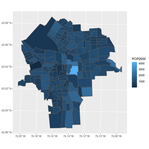
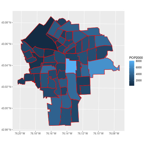
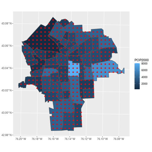
The census data is now easily visualized as a map.
ggplot(census_blockgroups,
       aes(fill = POP2000)) +
  geom_sf()
Feature collections also cooperate with the common “split-apply-combine” sequence of steps in data manipulation.
- split – group the features by some factor
- apply – apply a function that summarizes each subset, including their geometries
- combine – return the results as columns of a new feature collection
census_tracts <- census_blockgroups %>%
  group_by(TRACT) %>%
  summarise(
    POP2000 = sum(POP2000),
    perc_hispa = sum(HISPANIC) / POP2000)
Here, we use the dplyr function group_by to specify that we are doing an operation
on all block groups within a Census tract.
We can use summarise() to calculate as many summary statistics as we want, each one separated by a comma.
Here POP2000 is the sum of all block group populations in each tract and perc_hispa is the sum of the Hispanic
population divided by the total population (because now we have redefined POP2000 to be the population total).
The summarise() operation automatically combines the block group polygons from each tract!
Read in the census tracts from a separate shapefile to confirm that the boundaries were dissolved as expected.
tracts <- st_read('data/ct_00')
Reading layer `ct_00' from data source `/nfs/public-data/training/ct_00' using driver `ESRI Shapefile'
Simple feature collection with 57 features and 7 fields
Geometry type: POLYGON
Dimension:     XY
Bounding box:  xmin: 401938.3 ymin: 4759734 xmax: 412486.4 ymax: 4771049
CRS:           32618
ggplot(census_tracts,
       aes(fill = POP2000)) +
  geom_sf() +
  geom_sf(data = tracts,
          color = 'red', fill = NA)
By default, the sticky geometries are summarized with st_union. The
alternative st_combine does not dissolve internal boundaries. Check
?summarise.sf for more details.
Spatial Join
To summarize average lead concentration by census tracts, we need to spatially join the lead data with the census tract boundaries.
The data about lead contamination in soils is at points; the census information is for polygons. Combine the information from these tables by determining which polygon contains each point.
ggplot(census_tracts,
       aes(fill = POP2000)) +
  geom_sf() +
  geom_sf(data = lead, color = 'red',
          fill = NA, size = 0.1)

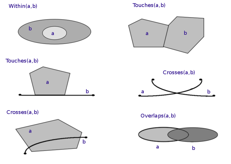
In the previous section, we performed a table join using a non-spatial data type. More specifically, we performed an equality join: records were merged wherever the join variable in the “left table” equalled the variable in the “right table”. Spatial joins operate on the “geometry” columns and require expanding beyond equality-based matches. Several different kinds of “intersections” can be specified that denote a successful match.
Before doing any spatial join, it is essential that both tables share a common CRS.
> st_crs(lead)
Coordinate Reference System:
  User input: EPSG:32618
  wkt:
PROJCS["WGS 84 / UTM zone 18N",
    GEOGCS["WGS 84",
        DATUM["WGS_1984",
            SPHEROID["WGS 84",6378137,298.257223563,
                AUTHORITY["EPSG","7030"]],
            AUTHORITY["EPSG","6326"]],
        PRIMEM["Greenwich",0,
            AUTHORITY["EPSG","8901"]],
        UNIT["degree",0.0174532925199433,
            AUTHORITY["EPSG","9122"]],
        AUTHORITY["EPSG","4326"]],
    PROJECTION["Transverse_Mercator"],
    PARAMETER["latitude_of_origin",0],
    PARAMETER["central_meridian",-75],
    PARAMETER["scale_factor",0.9996],
    PARAMETER["false_easting",500000],
    PARAMETER["false_northing",0],
    UNIT["metre",1,
        AUTHORITY["EPSG","9001"]],
    AXIS["Easting",EAST],
    AXIS["Northing",NORTH],
    AUTHORITY["EPSG","32618"]]
> st_crs(census_tracts)
Coordinate Reference System:
  User input: 32618
  wkt:
PROJCS["WGS_1984_UTM_Zone_18N",
    GEOGCS["GCS_WGS_1984",
        DATUM["WGS_1984",
            SPHEROID["WGS_84",6378137.0,298.257223563]],
        PRIMEM["Greenwich",0.0],
        UNIT["Degree",0.0174532925199433],
        AUTHORITY["EPSG","4326"]],
    PROJECTION["Transverse_Mercator"],
    PARAMETER["False_Easting",500000.0],
    PARAMETER["False_Northing",0.0],
    PARAMETER["Central_Meridian",-75.0],
    PARAMETER["Scale_Factor",0.9996],
    PARAMETER["Latitude_Of_Origin",0.0],
    UNIT["Meter",1.0],
    AUTHORITY["EPSG","32618"]]
The st_join function performs a left join using the geometries of the two
simple feature collections.
> st_join(lead, census_tracts)
Simple feature collection with 3149 features and 5 fields
Geometry type: POINT
Dimension:     XY
Bounding box:  xmin: 401993 ymin: 4759765 xmax: 412469 ymax: 4770955
CRS:           EPSG:32618
First 10 features:
   ID      ppm TRACT POP2000 perc_hispa                 geometry
1   0 3.890648  6102    2154 0.01578459 POINT (408164.3 4762321)
2   1 4.899391  3200    2444 0.10515548 POINT (405914.9 4767394)
3   2 4.434912   100     393 0.03053435   POINT (405724 4767706)
4   3 5.285548   700    1630 0.03190184 POINT (406702.8 4769201)
5   4 5.295919  3900    4405 0.23541430 POINT (405392.3 4765598)
6   5 4.681277  6000    3774 0.04027557 POINT (405644.1 4762037)
7   6 3.364148  5602    2212 0.08318264 POINT (409183.1 4763057)
8   7 4.096946   400    3630 0.01019284 POINT (407945.4 4770014)
9   8 4.689880  6000    3774 0.04027557 POINT (406341.4 4762603)
10  9 5.422257  2100    1734 0.09169550 POINT (404638.1 4767636)
- Only the “left” geometry is preserved in the output
- Matching defaults to
st_intersects, but permits any predicate function (usejoinargument to specify)
> st_join(lead, census_tracts,
+   join = st_contains)
Simple feature collection with 3149 features and 5 fields
Geometry type: POINT
Dimension:     XY
Bounding box:  xmin: 401993 ymin: 4759765 xmax: 412469 ymax: 4770955
CRS:           EPSG:32618
First 10 features:
   ID      ppm TRACT POP2000 perc_hispa                 geometry
1   0 3.890648    NA      NA         NA POINT (408164.3 4762321)
2   1 4.899391    NA      NA         NA POINT (405914.9 4767394)
3   2 4.434912    NA      NA         NA   POINT (405724 4767706)
4   3 5.285548    NA      NA         NA POINT (406702.8 4769201)
5   4 5.295919    NA      NA         NA POINT (405392.3 4765598)
6   5 4.681277    NA      NA         NA POINT (405644.1 4762037)
7   6 3.364148    NA      NA         NA POINT (409183.1 4763057)
8   7 4.096946    NA      NA         NA POINT (407945.4 4770014)
9   8 4.689880    NA      NA         NA POINT (406341.4 4762603)
10  9 5.422257    NA      NA         NA POINT (404638.1 4767636)
This command would match on polygons within (contained by) each point, which is the wrong way around. Stick with the default.
The population data is at the coarser scale, so the lead concentration ought to be averaged
within a census tract. Once each lead measurement is joined to TRACT, the
spatial data can be dropped using st_drop_geometry().
lead_tracts <- lead %>%
    st_join(census_tracts) %>%
    st_drop_geometry()
Two more steps are needed: group_by() the data by TRACT and summarise() to average the lead concentrations within each TRACT.
lead_tracts <- lead %>%
    st_join(census_tracts) %>%
    st_drop_geometry() %>%
    group_by(TRACT) %>%
    summarise(avg_ppm = mean(ppm))
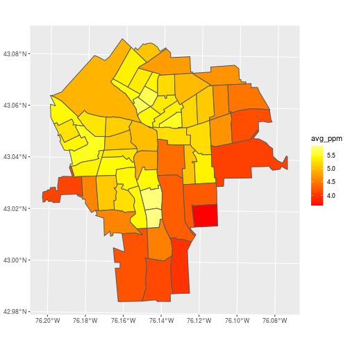
To visualize the average lead concentration from soil samples within each census tract,
merge the data frame to the sf object on the TRACT column.
Again, we use inner_join to keep all rows with matching keys between census_tracts and lead_tracts.
census_lead_tracts <- census_tracts %>%
  inner_join(lead_tracts)
Make a plot of avg_ppm for each census tract.
ggplot(census_lead_tracts,
       aes(fill = avg_ppm)) +
  geom_sf() +
  scale_fill_gradientn(
    colors = heat.colors(7))
A problem with this approach to aggregation is that it ignores autocorrelation. Points close to each other tend to have similar values and shouldn’t be given equal weight in averages within a polygon.
Take a closer look at tract 5800 (around 43.025N, 76.152W), and notice that several low values are nearly stacked on top of each other.
library(mapview)

mapview(lead['ppm'],
        map.types = 'OpenStreetMap',
        viewer.suppress = TRUE) +
  mapview(census_tracts,
          label = census_tracts$TRACT,
          legend = FALSE)
The Semivariogram
To correct for the bias introduced by uneven sampling of soil lead concentrations across space, we will generate a gridded layer (surface) from lead point measurements and aggregate the gridded values at the census tract level. To generate the surface, you will need to fit a variogram model to the sample lead measurements.
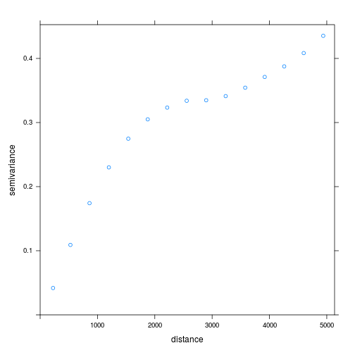
A semivariogram quantifies the effect of distance on the correlation between values from different locations. On average, measurements of the same variable at two nearby locations are more similar (lower variance) than when those locations are distant.
The gstat library, a geospatial analogue to the stats library, provides variogram estimation, among several additional tools.
library(gstat)
lead_xy <- read.csv('data/SYR_soil_PB.csv')
The empirical semivariogram shown below is a windowed average of the squared difference in lead concentrations between sample points. As expected, the difference increases as distance between points increases and eventually flattens out at large distances.
v_ppm <- variogram(
  ppm ~ 1,
  locations = ~ x + y,
  data = lead_xy)
plot(v_ppm)
Here we use the formula ppm ~ 1 to specify that lead concentration ppm is
the dependent variable, and we are not fitting any trend (1 means intercept only).
We pass another formula to the locations argument, locations = ~ x + y,
to specify the x and y coordinate of each location.
Fitting a model semivariogram tidies up the information about autocorrelation in the data, so we can use it for interpolation.
v_ppm_fit <- fit.variogram(
  v_ppm,
  model = vgm(model = "Sph", psill = 1, range = 900, nugget = 1))
plot(v_ppm, v_ppm_fit)
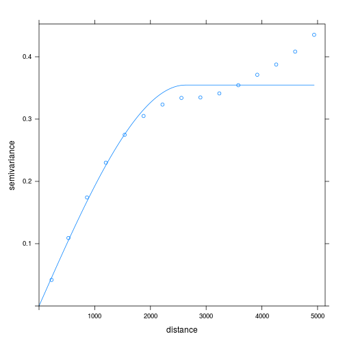
We use fit.variogram() to fit a model to our empirical variogram v_ppm. The type of
model is specified with the argument model = vgm(...).
The parameters of vgm(), which we use to fit the variogram,
are the model type, here "Sph" for spherical meaning equal trends in all directions,
the psill or height of the plateau where the variance flattens out, the range or distance
until reaching the plateau, and the nugget or intercept.
A more detailed description is outside the scope of this
lesson; for more information check out the gstat documentation
and the references cited there.
Kriging
The modeled semivariogram acts as a parameter when performing Gaussian process regression, commonly known as kriging, to interpolate predicted values for locations near our observed data. The steps to perform kriging with the gstat library are:
- Generate a modeled semivariogram
- Generate new locations for “predicted” values
- Call
krigewith the data, locations for prediction, and semivariogram
Generate a low resolution (for demonstration) grid of points overlaying the bounding box for the lead data and trim it down to the polygons of interest. Remember, the goal is aggregating lead concentrations within each census tract.
pred_ppm <- st_make_grid(
  lead, cellsize = 400,
  what = 'centers')
pred_ppm <- pred_ppm[census_tracts]
Here, st_make_grid() creates a grid of points, pred_ppm, at the center of 400-meter squares over the
extent of the lead geometry. We can specify cellsize = 400 because the CRS of lead is
in units of meters, and what = 'centers' means we want the points at the center of each
grid cell. The grid spatial resolution is derived from the extent of the region and the
application (coarser or finer depending on the use). Next, we find only the points contained
within census tract polygons using the shorthand pred_ppm[census_tracts]. This is shorthand for
using st_intersects() to find which grid points are contained within the polygons, then subsetting the
grid points accordingly.
Map the result to verify that we have only points contained in our census tracts.
ggplot(census_tracts,
       aes(fill = POP2000)) +
  geom_sf() +
  geom_sf(data = pred_ppm,
          color = 'red', fill = NA)
Almost done …
- Generate a modeled semivariogram
- Generate new locations for “predicted” values
- Call
krigewith the data, locations, and semivariogram
The first argument of krige specifies the model for the means, which is constant according to our
formula for lead concentrations (again, ~ 1 means no trend).
The observed ppm values are in the locations data.frame along with the point geometry.
The result is a data frame with predictions for lead concentrations at the points in newdata.
pred_ppm <- krige(
  formula = ppm ~ 1,
  locations = lead,
  newdata = pred_ppm,
  model = v_ppm_fit)
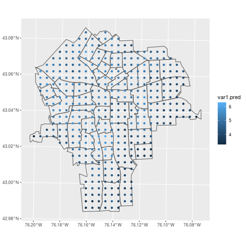
Verify that krige generated predicted values for each of the grid points.
ggplot() +
  geom_sf(data = census_tracts,
          fill = NA) +
  geom_sf(data = pred_ppm,
          aes(color = var1.pred))
And the same commands that joined lead concentrations to census tracts apply to joining the predicted concentrations too.
pred_ppm_tracts <-
  pred_ppm %>%
  st_join(census_tracts) %>%
  st_drop_geometry() %>%
  group_by(TRACT) %>%
  summarise(pred_ppm = mean(var1.pred))
census_lead_tracts <-
  census_lead_tracts %>%
  inner_join(pred_ppm_tracts)
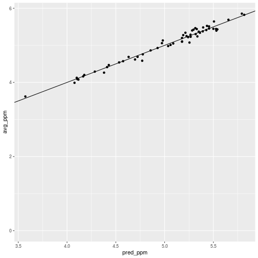
Here, we find the predicted lead concentration value for each census tract
by taking the means of the kriged grid point values (var1.pred),
grouped by TRACT.
The predictions should be, and are, close to the original averages with deviations that correct for autocorrelation.
ggplot(census_lead_tracts,
       aes(x = pred_ppm, y = avg_ppm)) +
  geom_point() +
  geom_abline(slope = 1)
The effect of paying attention to autocorrelation is subtle, but it is noticeable and had the expected effect in tract 5800. The pred_ppm value is a little higher than the average.
> census_lead_tracts %>% filter(TRACT == 5800)
Simple feature collection with 1 feature and 5 fields
Geometry type: POLYGON
Dimension:     XY
Bounding box:  xmin: 405633.1 ymin: 4762867 xmax: 406445.9 ymax: 4764711
CRS:           32618
# A tibble: 1 x 6
  TRACT POP2000 perc_hispa                             geometry avg_ppm pred_ppm
* <int>   <int>      <dbl>                        <POLYGON [m]>   <dbl>    <dbl>
1  5800    2715     0.0302 ((406445.9 4762893, 406017.5 476286…    5.44     5.53
Regression
Continuing the theme that vector data is tabular data, the natural progression in statistical analysis is toward regression. Building a regression model requires making good assumptions about relationships in your data:
- between columns as independent and dependent variables
- between rows as more-or-less independent observations
Here we examine spatial autocorrelation in the soil lead data and perform a spatial regression between lead and percentage of Hispanic population. We visually examine spatial autocorrelation with a Moran’s I plot and fit a spatial autoregressive model to correct for the clustering effect where soil samples closer together in space tend to have similar lead concentrations. But first, let’s see what would happen if we completely ignore spatial autocorrelation and fit a simple linear model.
The following model assumes an association (in the linear least-squares sense), between the Hispanic population and lead concentrations and assumes independence of every census tract (i.e. row).
ppm.lm <- lm(pred_ppm ~ perc_hispa,
  data = census_lead_tracts)
Is that model any good?
census_lead_tracts <- census_lead_tracts %>%
  mutate(lm.resid = resid(ppm.lm))
plot(census_lead_tracts['lm.resid'])

We can see that areas with negative and positive residuals are not randomly distributed. They tend to cluster together in space: there is autocorrelation. It is tempting to ask for a semivariogram plot of the residuals, but that requires a precise definition of the distance between polygons. A favored alternative for quantifying autoregression in non-point feature collections is Moran’s I. This analog to Pearson’s correlation coefficient quantifies autocorrelation rather than cross-correlation.
Moran’s I is the correlation between all pairs of features, weighted to emphasize features that are close together. It does not dodge the problem of distance weighting, but provides default assumptions for how to do it.
If you are interested in reading more, this chapter from the ebook Intro to GIS and Spatial Analysis provides an accessible introduction to the Moran’s I test.
library(sp)
library(spdep)
library(spatialreg)

tracts <- as(
  st_geometry(census_tracts), 'Spatial')
tracts_nb <- poly2nb(tracts)
The function poly2nb() from spdep generates a neighbor list from
a set of polygons. This object is a list of each polygon’s neighbors that share
a border with it (in matrix form, this would be called an adjacency matrix).
Unfortunately, spdep was created before sf, so the two
packages aren’t compatible. That’s why we first need to convert the geometry of census_tracts
to an sp object using as(st_geometry(...), 'Spatial').
The tracts_nb object is of class nb and contains the network of features sharing a boundary,
even if they only touch at a single point.
plot(census_lead_tracts['lm.resid'],
     reset = FALSE)
plot.nb(tracts_nb, coordinates(tracts),
        add = TRUE)
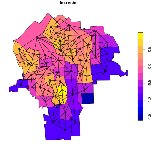
plot.nb() plots a network graph, given a nb object and a matrix of coordinates as
arguments. We extract a coordinate matrix from the Spatial object tracts using
coordinates().
Add weights to the neighbor links.
tracts_weight <- nb2listw(tracts_nb)
By default, nb2listw() weights each neighbor of a polygon equally, although other
weighting options are available. For example, you could give a link between a pair
of neighbors a higher weight if their centroids are closer together.
Visualize correlation between the residuals and the weighted average
of their neighbors with moran.plot from the
spdep package.
The positive trend line is consistent with the
earlier observation that features in close proximity have similar
residuals. In other words, the higher the residual
in a polygon, the higher the residual of its
neighboring polygons—thus the slope of the line is positive. This is
a bad thing because a good regression model should not show any
trend in its residuals. So we can’t be confident in the results of the
simple lm() that ignores spatial relationships.
moran.plot(
  census_lead_tracts[['lm.resid']],
  tracts_weight,
  labels = census_lead_tracts[['TRACT']],
  pch = 19)
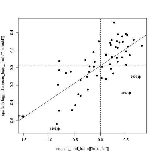
The first argument to moran.plot is the vector of data values (in this case the residuals),
and the second argument is the weighted neighbor list. The labels argument in this
case is the vector of tract codes. By default moran.plot will flag and label values
that have high influence on the relationship (the diamond-shaped points labeled with
census tract codes).
There are many ways to use geospatial information about tracts to impose assumptions about non-independence between observations in the regression. One approach is a Spatial Auto-Regressive (SAR) model, which regresses each value against the weighted average of neighbors.
In this SAR model, we are asking how much variation in soil lead concentration across census tracts is explained by percent Hispanic population, just like in the simple linear model we fit above. But the key difference is that the SAR model incorporates an additional random effect that accounts for the tendency of neighboring tracts to have similar lead concentration values — that is, the lead concentration values are spatially non-independent. For further reading, check out this chapter of the ebook Spatial Data Science, which is a great resource in general.
ppm.sarlm <- lagsarlm(
  pred_ppm ~ perc_hispa,
  data = census_lead_tracts,
  tracts_weight,
  tol.solve = 1.0e-30)
Here, lagsarlm() from spatialreg uses the same formula as the lm()
we did above, but we also need to supply the weighted neighbor list.
The tol.solve argument is needed for the numerical method the model uses.
The Moran’s I plot of residuals now shows less correlation; which means the SAR model’s assumption about spatial autocorrelation (i.e. between table rows) makes the rest of the model more plausible.
moran.plot(
  resid(ppm.sarlm),
  tracts_weight,
  labels = census_lead_tracts[['TRACT']],
  pch = 19)
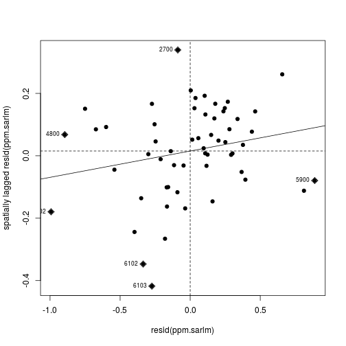
Feeling more confident in the model, we can now take a look at the regression coefficients and overall model fit.
> summary(ppm.sarlm)
Call:lagsarlm(formula = pred_ppm ~ perc_hispa, data = census_lead_tracts,
    listw = tracts_weight, tol.solve = 1e-30)

Residuals:
      Min        1Q    Median        3Q       Max
-0.992669 -0.210942  0.037845  0.246989  0.888440

Type: lag
Coefficients: (asymptotic standard errors)
            Estimate Std. Error z value Pr(>|z|)
(Intercept)  1.16047    0.46978  2.4702   0.0135
perc_hispa   1.45285    0.95717  1.5179   0.1291

Rho: 0.7499, LR test value: 22.434, p-value: 2.175e-06
Asymptotic standard error: 0.095079
    z-value: 7.8871, p-value: 3.1086e-15
Wald statistic: 62.207, p-value: 3.1086e-15

Log likelihood: -29.16485 for lag model
ML residual variance (sigma squared): 0.14018, (sigma: 0.37441)
Number of observations: 57
Number of parameters estimated: 4
AIC: 66.33, (AIC for lm: 86.764)
LM test for residual autocorrelation
test value: 4.5564, p-value: 0.032797
Summary
Rapid tour of packages providing tools for manipulation and analysis of vector data in R.
- sp: a low level package with useful
Spatial*class objects - spdep
moran.plot: infer autocorrelation from residual scatter plotspoly2nb,nb2listw: calculate spatial neighbors and their weights
- spatialreg
lagsarlm: SAR model estimation
If you need to catch-up before a section of code will work, just squish it's 🍅 to copy code above it into your clipboard. Then paste into your interpreter's console, run, and you'll be ready to start in on that section. Code copied by both 🍅 and 📋 will also appear below, where you can edit first, and then copy, paste, and run again.
# Nothing here yet!